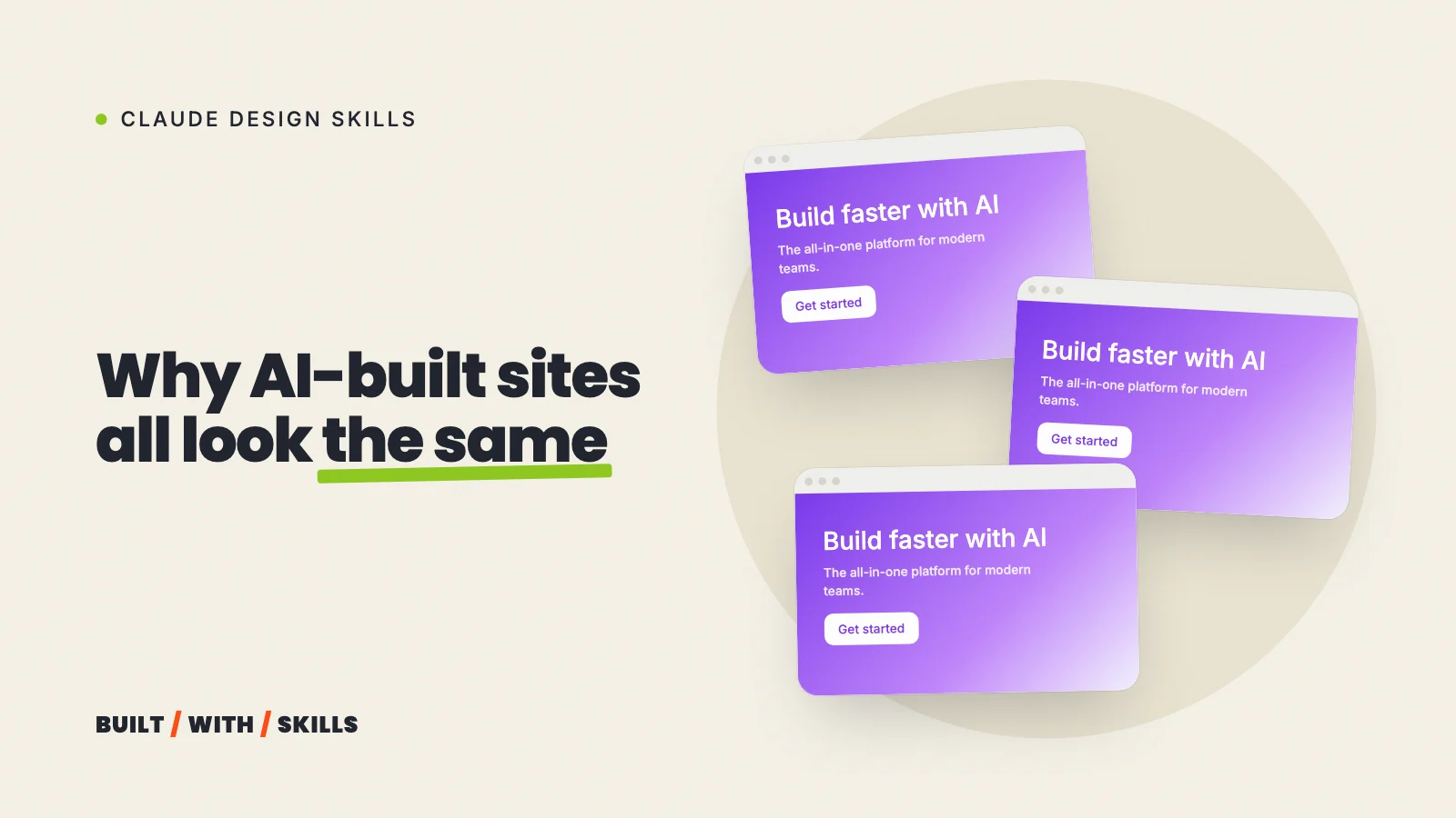

You can usually spot a vibe-coded website inside a second. There’s a big centred headline with a row of identical rounded cards underneath it, a little uppercase label over every heading, an arrow on every button, and copy that promises to make something seamless.
None of it is wrong. It just doesn’t belong to anyone.
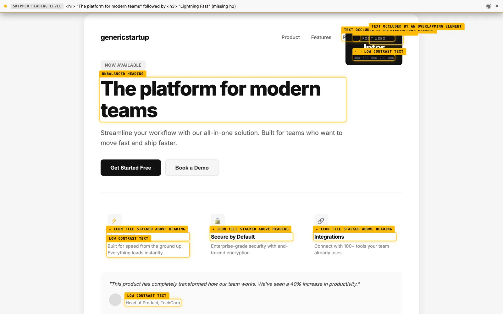
There’s one reason for it, and it’s the same whichever tool built the site: every design decision you don’t make, the AI makes for you, and it makes it the same way for everyone. Our own site has had three looks since August 2026, all of them built with Claude, so the examples in this guide come straight from our project history, mistakes included. It’s part of our series on Claude design skills.
Why AI tools reach for the same design#
A language model builds a page by choosing, at every step, whatever is most likely given everything it has seen. Ask for “a modern landing page” and say nothing more, and the most likely page is roughly the average of all of them.
Anthropic calls this distributional convergence. In a November 2025 post, it said an AI asked to build a landing page without guidance “will almost always conform to Inter fonts, purple gradients on white backgrounds, and minimal animations”.
Why? Because safe choices that offend nobody dominate the web pages models learn from. The same post has the hopeful bit too, because telling Claude to avoid Inter and Roboto improves the results straight away, which means the sameness comes from missing instructions rather than missing ability.
The same post shows the difference, using one prompt with and without the skill.
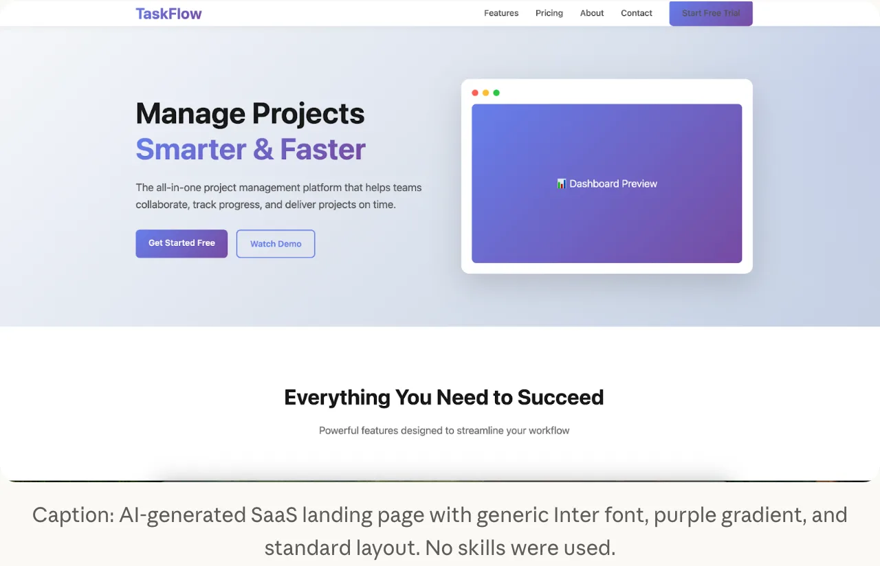
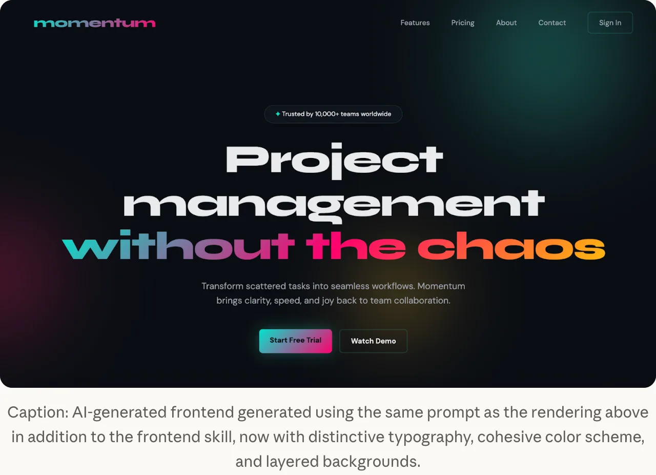
The look is what you get when the tool is the only one making design choices.
The tells have moved since 2025#
This is the part that dates quickly. Once everyone knew to ban purple and Inter, the models found new defaults, so the tells you’ll see in late 2026 aren’t the ones people were joking about in 2025.
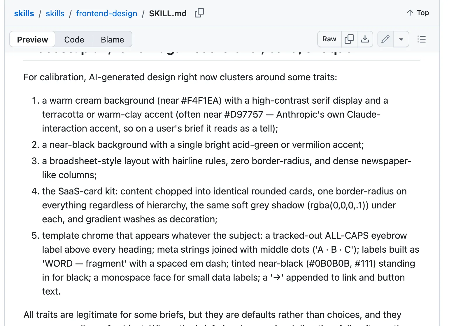
Anthropic keeps a list of them. Its own frontend-design skill, as of October 2026, tells Claude that AI-generated design “right now clusters around” five looks:
- A warm cream background with a high-contrast serif and a terracotta accent (the skill notes that the accent is close to Anthropic’s own brand colour).
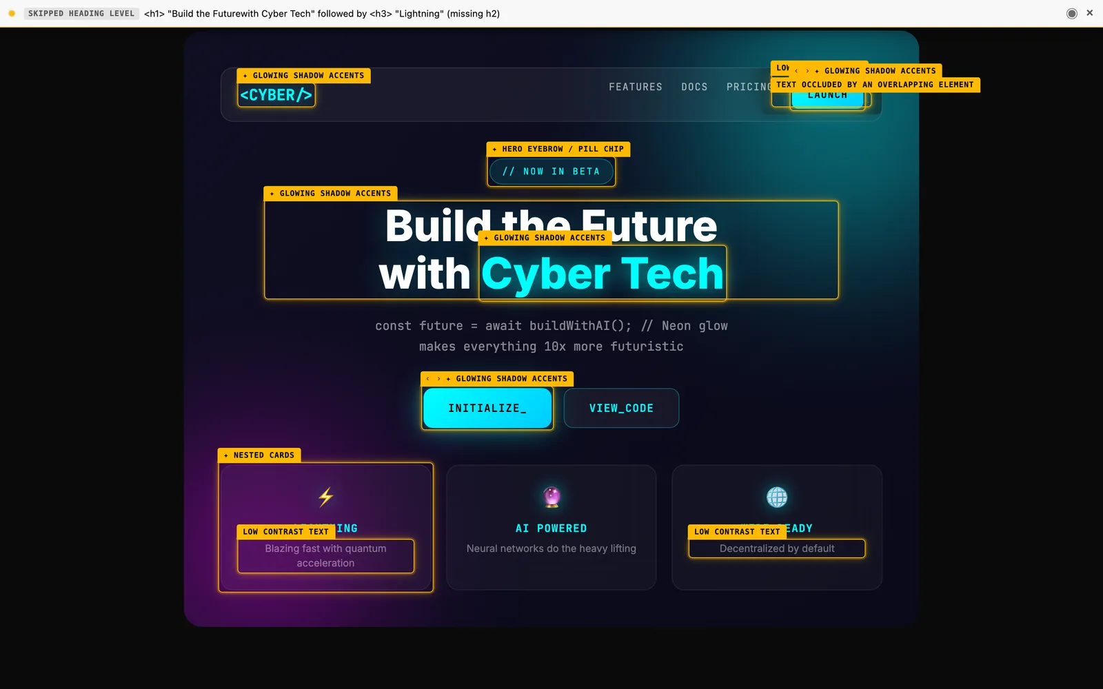
- A near-black background with a single bright accent in acid green or vermilion.
- A broadsheet layout with hairline rules, square corners and dense newspaper columns.
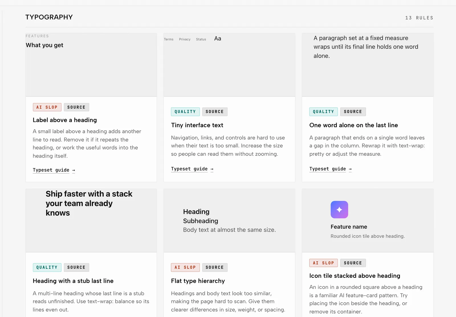
- The SaaS card kit, where content is chopped into identical rounded cards with the same radius and the same soft grey shadow on everything, plus gradient washes as decoration.
- Template chrome that turns up whatever the subject: a tracked-out all-caps label above every heading, details joined with middle dots, near-black standing in for black, small labels in a monospace font and an arrow tacked onto every button.
The skill adds that each of these suits some briefs. What makes them tells is that they’re defaults rather than choices, and they turn up no matter what the business is.
Impeccable’s catalogue has an example close to the second.
So banning purple fixes nothing. A prompt that only says “no purple” just moves you from one cluster to the next.
How to spot the tells on your own site#
Open your home page on your phone and go down this list. One or two is normal, and any of them can be a deliberate choice, but a home page that ticks most of the rows was designed by nobody in particular.
| The tell | Why it appears | The fix |
|---|---|---|
| A centred headline over a gradient, or a big number with a small label | The most common hero on the web | Decide what your first screen shows: you, your work, or the question your customer is asking |
| Three identical cards with icons | The default way to list anything | Use the real number of items, and show real things instead of icons |
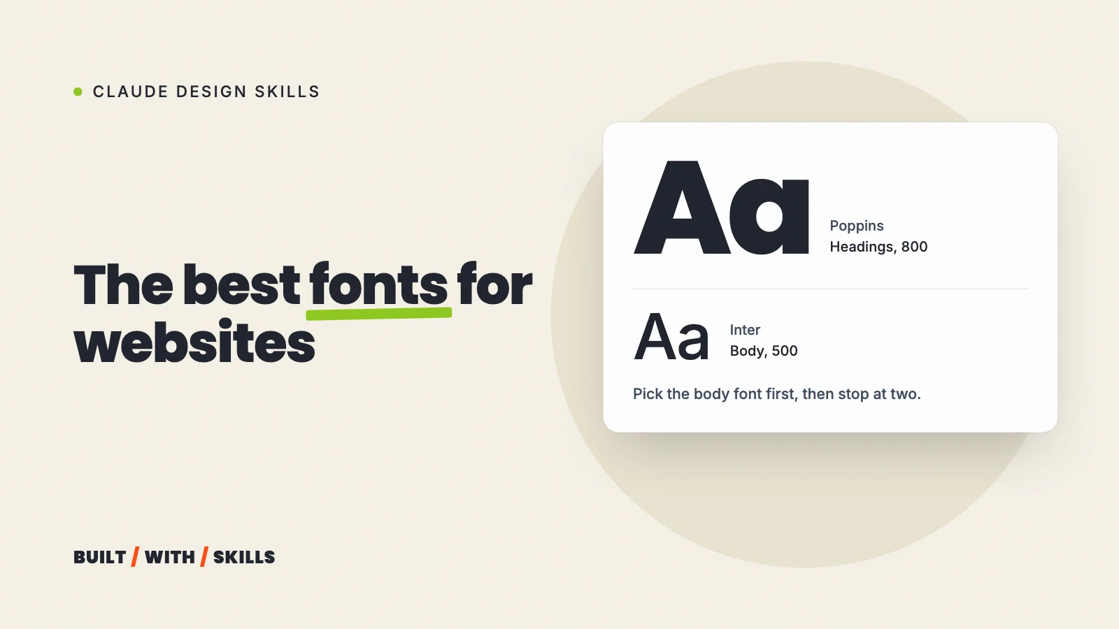
| Inter, or a serif paired with cream | The safe fonts for “modern” and “premium” | Choose one or two fonts on purpose and write down why (choosing fonts) |
| Purple, terracotta, or near-black with one glowing accent | The colours of the sites AI learned from | Take colours from your brand, your photos or your trade |
| Stock photos or AI-generated people | The quickest way to fill an image slot | Real photos of you, your team and your work, or a placeholder until you have them |
| The same rounded corners and soft shadow on everything | One style applied to every element | Decide what’s flat and what stands out, and keep to it |
| A fade-in on every section | Easy to add, so it gets added everywhere | Animate one thing that matters, or nothing |
| An all-caps label over every heading and an arrow on every button | Template chrome | Keep them only where they carry information |
Copy that says seamless, elevate and unlock |
The words AI writing defaults to | Write it yourself, then tidy it (the Humanizer skill helps) |
Different isn’t the goal#
But hold up. The answer isn’t a site so unusual that visitors can’t find the menu.
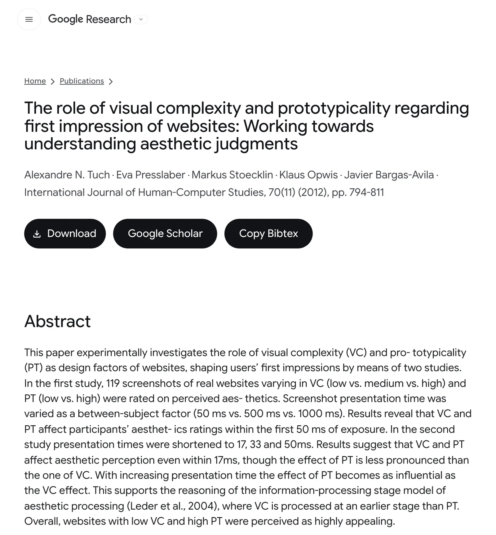
In 2012, Tuch and colleagues studied first impressions using 119 real website screenshots, and found that people formed a view of a site’s looks within 50 milliseconds. The sites they rated most appealing were the simple ones with a familiar, typical layout.
Familiar helps. Keep the navigation bar where people expect it, and keep one obvious button.
What should belong to you is everything inside that structure, from the colours and type to the photos, the spacing and the words. That’s exactly where vibe-coded sites are blank.
What redesigning this site taught us#
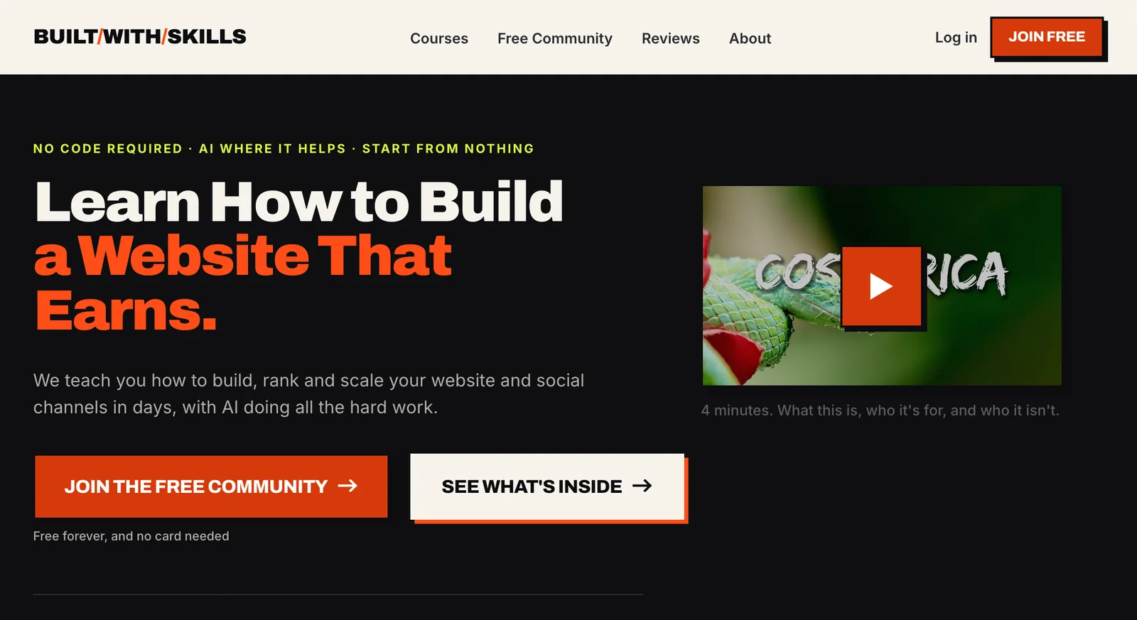
Our first version, in August 2026, was a hard-edged, poster-style design in orange. We’ve rebuilt the look twice since. Three things did most of the work.
A reference that was measured, not described#
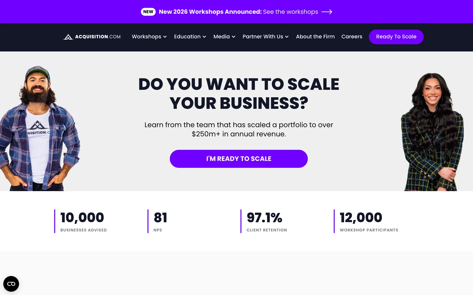
On 30 August we asked Claude to restyle the site after a web designer’s site we liked, working from a description. It came back close, and wrong on nearly every detail that mattered:
- An emerald accent, where the real one was lime.
- White text on the accent, where the real site used dark ink.
- Pill-shaped corners, where the real ones were nearly square (3 to 5 pixels).
- Archivo for headings instead of Poppins.
- A resting shadow on every card, which the real site doesn’t have.
Two days later we had Claude open the real site in a headless browser and read the styles it actually uses, then rebuilt the design system from those numbers, with each one traced back to what it was measured from. Describing a site gets you a guess. Measuring it gets you the site.
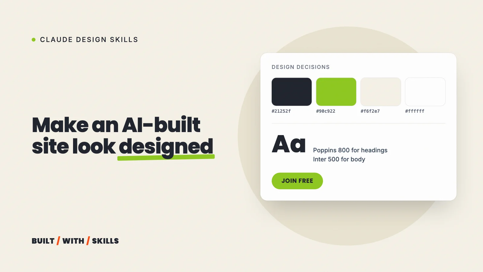
Measured from the live site, each value traced to its sourceAccent: lime #90c922 (we had emerald)Text on the accent: dark ink #21252f (we had white)Corners: nearly square, 3 to 5px (we had pills)Headings: Poppins (we had Archivo)Cards: flat at rest, shadow on buttons only (we had a shadow on every card)A design file Claude is told to read#
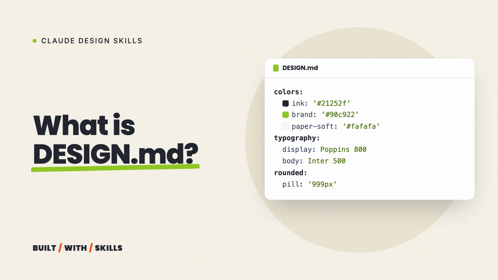
On 30 August, the same day as that first restyle, we also wrote the system down in a DESIGN.md. It covers the colours and what each is for, the fonts, the spacing, the components and a list of don’ts. Ours now bans dark heroes, icons as decoration, stock or AI photos, logo walls, countdown timers and white text on lime, among other things.
Our project rules add that a missing photo shows as a labelled grey box, never a stand-in person.
There’s a catch, though. Claude Code doesn’t open DESIGN.md by itself.
You either import it from your CLAUDE.md with a line that says @DESIGN.md, or use a design skill that reads it (on our site, Impeccable was given it as the brief for every command it ran). How to write a DESIGN.md covers both.
sed -n '2,15p' DESIGN.mdname: Built With Skillsdescription: Free, founder-taught website and SEO education, designed like acquisition.com. White grounds, one lime accent, uppercase headlines, pill buttons, one action per page.colors: ink: '#21252f' ink-soft: '#414e60' ink-muted: '#6b7280' paper: '#ffffff' paper-soft: '#fafafa' paper-deep: '#f3f5f7' paper-line: '#e5e7eb' brand: '#90c922' brand-deep: '#7ab01c' brand-ink: '#4a7310' signal: '#ff4d17'A critique before changes#
The Impeccable skill reviewed our home page on 30 August. It found two fixes we hadn’t made: a screen-reader note on links that open in a new tab, and a reassurance line under the main buttons.
It also flagged two gaps that were already on our to-do list (a placeholder hero video, and proof screenshots with no source). The Impeccable skill explains how to run the same review.
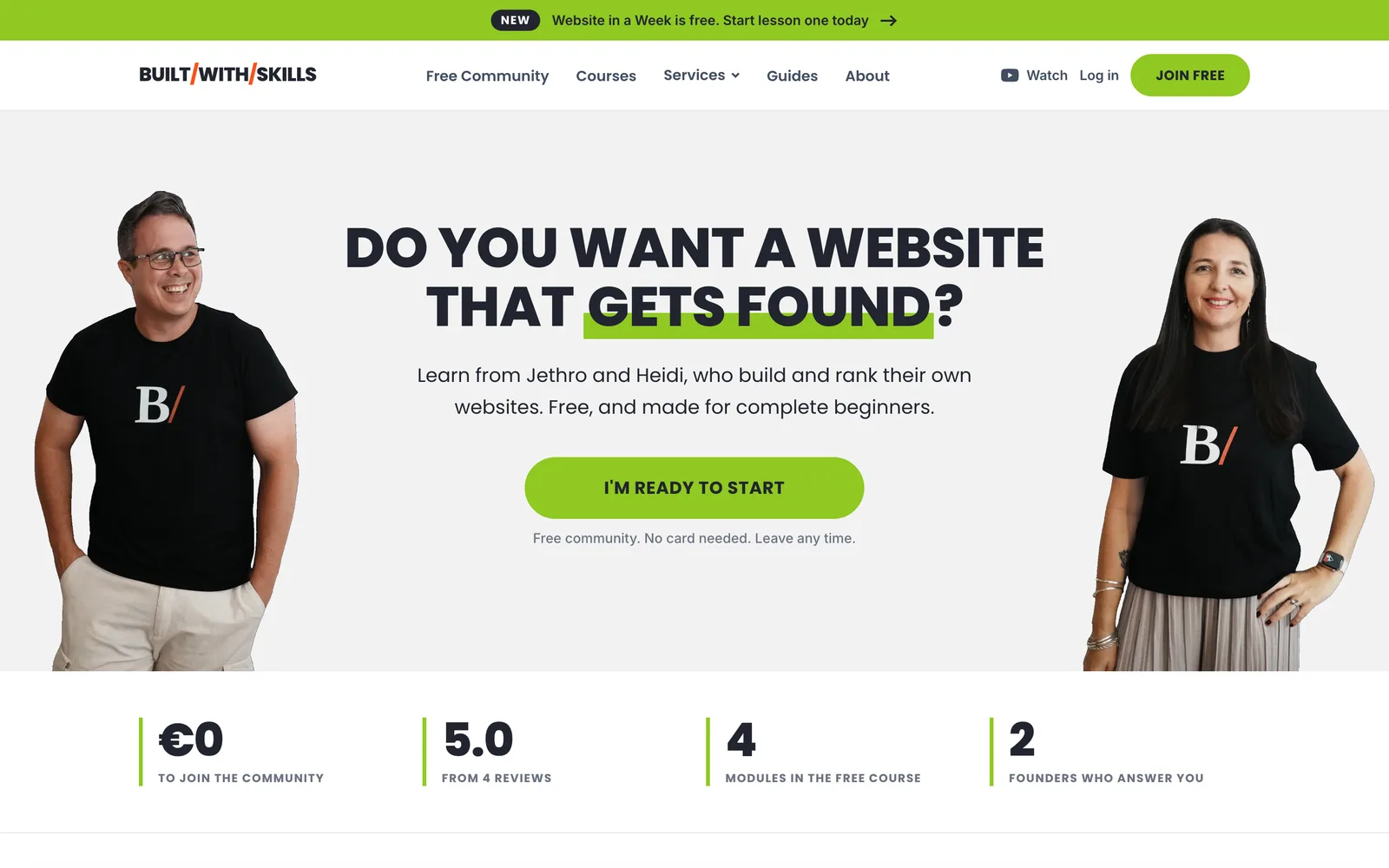
On 17 October we changed direction again, to a look modelled on acquisition.com, with white backgrounds, one lime accent for every action, extra-bold uppercase headlines and pill buttons. Because the whole system lived in one file, that redesign reached every page in a single commit across 73 files, with DESIGN.md rewritten to match.
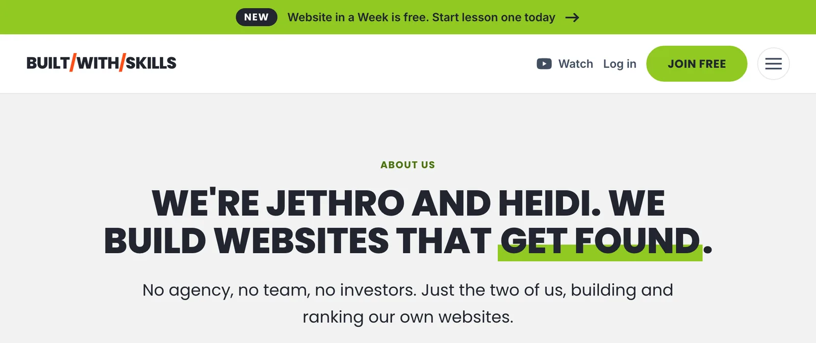
One footnote against ourselves. Our inner pages open with a small tracked-out uppercase label above the headline, which is on Anthropic’s list of template chrome.
The label came with the look we chose to copy rather than by default, so we’ve kept it. That’s the test we’d apply to any tell on your site too, because if you can say why it’s there, it’s a choice, and you can keep it.
Fixing your own site, in order#
- Write a one-paragraph brief. Say who the site is for, the one thing you want them to do, and which two sites have a look you like.
- Measure your reference sites. Ask Claude to open them in a browser and read their real fonts, colours and corner sizes, rather than describing them from memory.
- Pick your fonts and colours, and write them into a
DESIGN.mdalong with a list of things never to do. - Replace every stock or AI image with a real photo, or with a placeholder until you’ve taken one.
- Install a design skill and ask it to critique your home page before it changes anything. Anthropic’s frontend-design skill is the free place to start.
- Fix the first screen first. It’s what visitors judge in those first 50 milliseconds.
- Rewrite the copy in your own words.
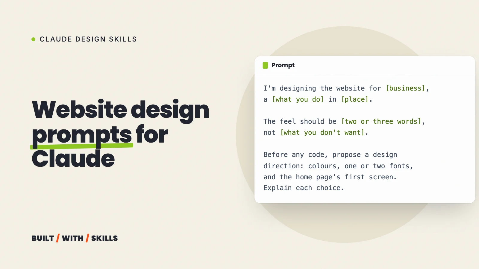
Website design prompts that don’t produce AI slop has a prompt for each of these steps.
If you’d rather hand the whole job over, rebuilding sites like this is what we do.