
The best font for your website is one that’s easy to read at body size, suits the business and was picked on purpose. That last part is where most AI-built sites fall over, because left to itself Claude grabs the same few safe fonts every single time, and that’s one reason vibe-coded sites look alike.
We’ve changed the fonts on this site twice since August. The first time, Claude had guessed the heading font wrong; the second, we wanted the guides in a serif for long reading. Both stories are below, along with exactly what our fonts weigh.
By the end of this guide you’ll know how to choose a body font and a heading font, and how to load them without handing your visitors’ IP addresses to Google. It’s part of our series on Claude design skills.
Start with the body text#
Most of your site is paragraphs, so pick the font people will spend longest reading before you even think about headlines. A good body font has clear letter shapes at small sizes, comes in a few weights (regular and bold at the very least) and never draws attention to itself.
Three settings matter as much as the font itself:
- Size. 16 to 18 pixels suits most fonts. Ours is 17 pixels on most pages and 18 to 19 on guide pages, where people read for longer.
- Line length. Keep lines under about 80 characters. That’s the limit in WCAG’s visual presentation guideline, and Anthropic’s own frontend-design skill tells Claude the same thing.
- Line height. Around 1.5 times the font size for body text, and a little more for a serif.
Serif or sans-serif? Either reads fine on a modern screen.
A clean sans-serif suits short pages people scan, while a serif can make a long read feel calmer. That’s why our guides use a different body font from the rest of the site. So pick a plain, well-made body font, then spend just as long on those three settings.
Then the headings: one family or two#
You have two safe choices here. Use the same family in a heavier weight, which always works, or pick a second font that’s clearly different from the first.
The trouble starts in the middle, because two sans-serifs that are nearly alike look like a mistake rather than a decision. Anthropic’s frontend-design skill says it plainly: “use one family or two, and if two, make them clearly distinct.”
Then match the font to the business. A solicitor and a surf school shouldn’t share a typeface. As a rough guide, serifs tend to read as traditional or editorial, rounded geometric sans-serifs as modern and friendly, and condensed or slab faces as loud.
Stop at two. A third font almost never earns its place, and every extra family is one more file your visitors have to download.
Pairings worth trying#
Every font in this table is free on Google Fonts, and we checked each one is still there in October 2026.
| Headings | Body | Feels |
|---|---|---|
| Poppins (heavy weights) | Inter | Modern, friendly, confident (this site) |
| Fraunces | Inter | Warm, a little editorial |
| Playfair Display | Source Sans 3 | Classic, elegant |
| Space Grotesk | IBM Plex Sans | Technical, crisp |
| DM Serif Display | DM Sans | Polished, approachable |
| Inter (one family, several weights) | Inter | Clean and neutral |
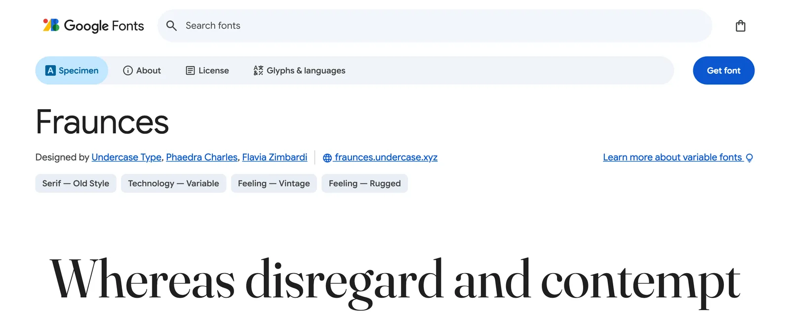
Steal any of them. Just know what you’re getting, because these are popular pairings and plenty of other sites already use them, Inter most of all.
For body text, that’s fine. Nobody should notice a body font.
Headings are different. That’s where the font carries the personality of the page, so treat the table as a place to start looking and try your shortlist on a real page of your own site before you commit.
What this site uses, and why#
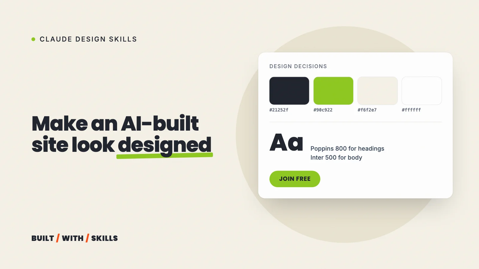
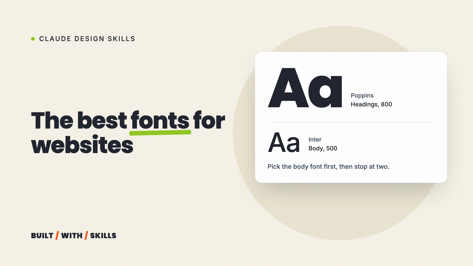
Headings are Poppins at weight 800, in capitals. Body text is Inter at weight 500 (a touch heavier than the usual 400) at 17 pixels.
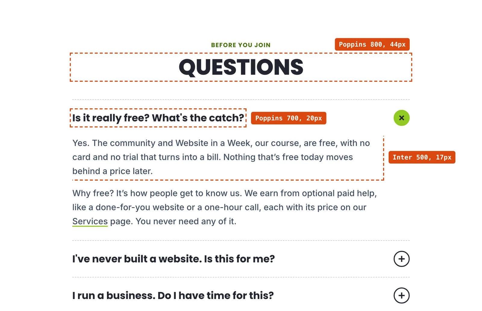
The capitals come from CSS, not from the text. We write every heading in sentence case and let the stylesheet capitalise it.
Why bother? Because a screen reader can spell out a heading typed in capitals letter by letter.
The weights are a decision too. The wordmark in our logo is Poppins at 800, so our DESIGN.md says 800 is the heaviest weight we load, since adding 900 would change the logo.
We didn’t start with Poppins, though. On 30 August we asked Claude to restyle the site after a designer’s site, working only from a description, and it picked Archivo for the headlines; two days later we had it load the real site in a browser and read the actual styles, and they used Poppins.
We switched, and kept it through the October redesign. So if you’re borrowing a look, have Claude read the real styles rather than a description of them.
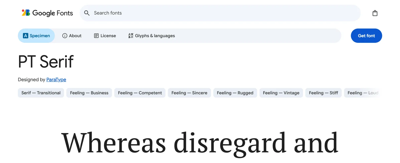
The guides you’re reading now are the exception. Their body text is PT Serif, at 18 pixels on phones and 19 on wider screens, with a line height of 1.6. It loads on guide pages only, so the rest of the site doesn’t pay for it.
What our fonts weigh#
We checked a production build of the home page on 26 October 2026. Poppins comes as a separate file for each weight, and we load five of them (400 to 800), each about 8 KB once it’s cut down to Latin characters, which makes 39 KB together. Inter is a variable font, meaning one file holds every weight, and that file is 48 KB.
That’s about 88 KB of fonts in total. The Poppins line is the one to learn from, because with a font that isn’t variable, every weight you load is another download. If you only use two weights, load two.
for f in $(curl -s https://www.builtwithskills.com/ | grep -o '/_astro/fonts/[^?"]*' | sort -u); do echo "$(curl -s https://www.builtwithskills.com$f | wc -c) $f"; done 8000 /_astro/fonts/24bd42e7d5d07c43.woff2 48256 /_astro/fonts/5288773a5a229461.woff2 7816 /_astro/fonts/7e794b428366bde7.woff2 7884 /_astro/fonts/9a9f7fec767689d8.woff2 7748 /_astro/fonts/ca5b002779022105.woff2 7824 /_astro/fonts/d202a6ffe83bf79c.woff2Load fonts from your own site#
There are two ways to put a Google Font on a page, and the difference matters if you have visitors in Europe.
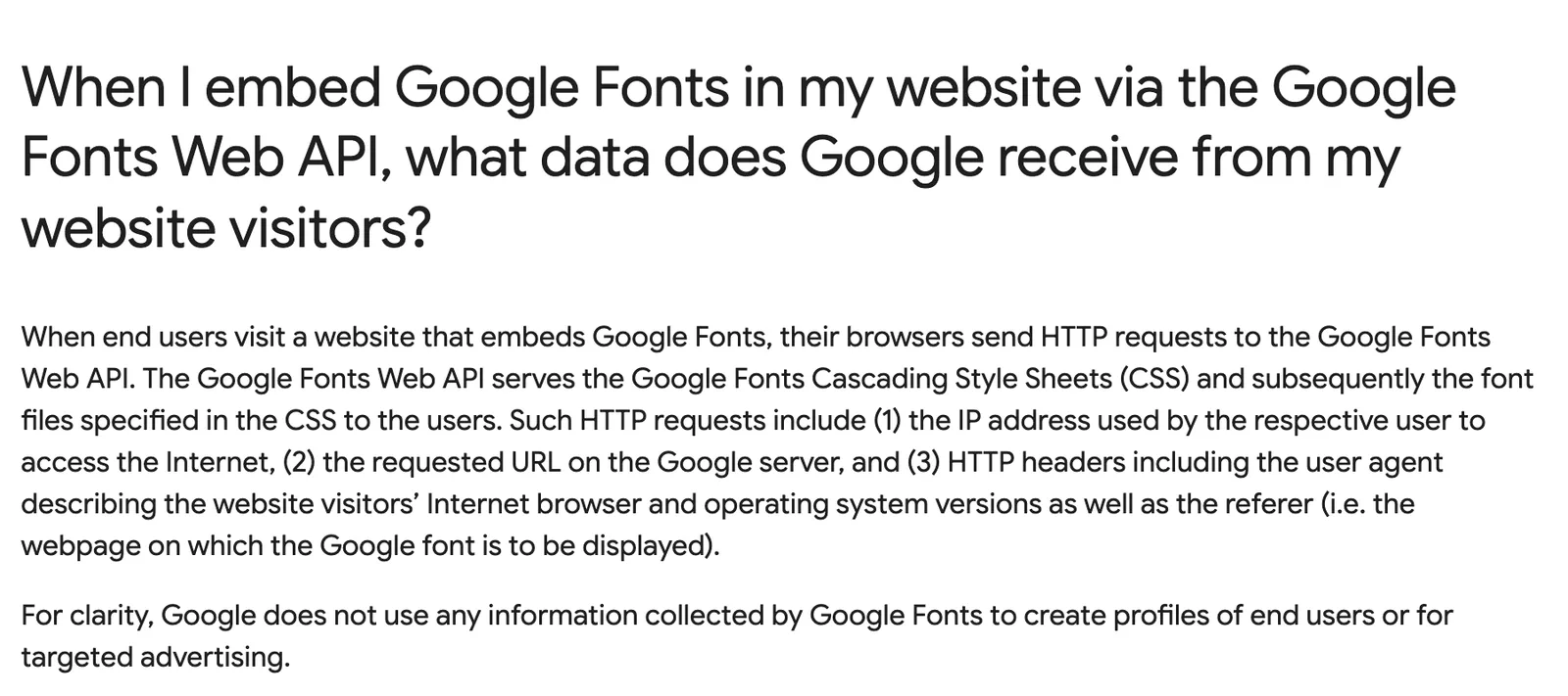
Loading from Google’s servers is the copy-and-paste way, where each visitor’s browser fetches the font from Google. Google’s own FAQ says that request carries the visitor’s IP address, the page they came from and their browser details, though no cookies.
That’s what landed one site owner in court. On 20 January 2022 the Munich regional court ruled that a site loading fonts this way without consent had broken GDPR, and ordered the owner to pay the visitor €100 (judgment 3 O 17493/20).
The court’s reasoning is the bit worth remembering. The site had no legitimate reason to send the data at all, because the same fonts work perfectly well without ever connecting to Google.
By November 2022, Lower Saxony’s data protection authority was warning of a wave of letters to site owners demanding damages on the back of that ruling, and recommending the obvious fix: download the fonts and host them on your own server.
Hosting the files yourself sidesteps the whole mess. Google’s FAQ confirms that when the font comes from your own server, Google gets no data about your visits, and you also stop a slow third-party server holding up your page.
How you do it depends on what the site is built with:
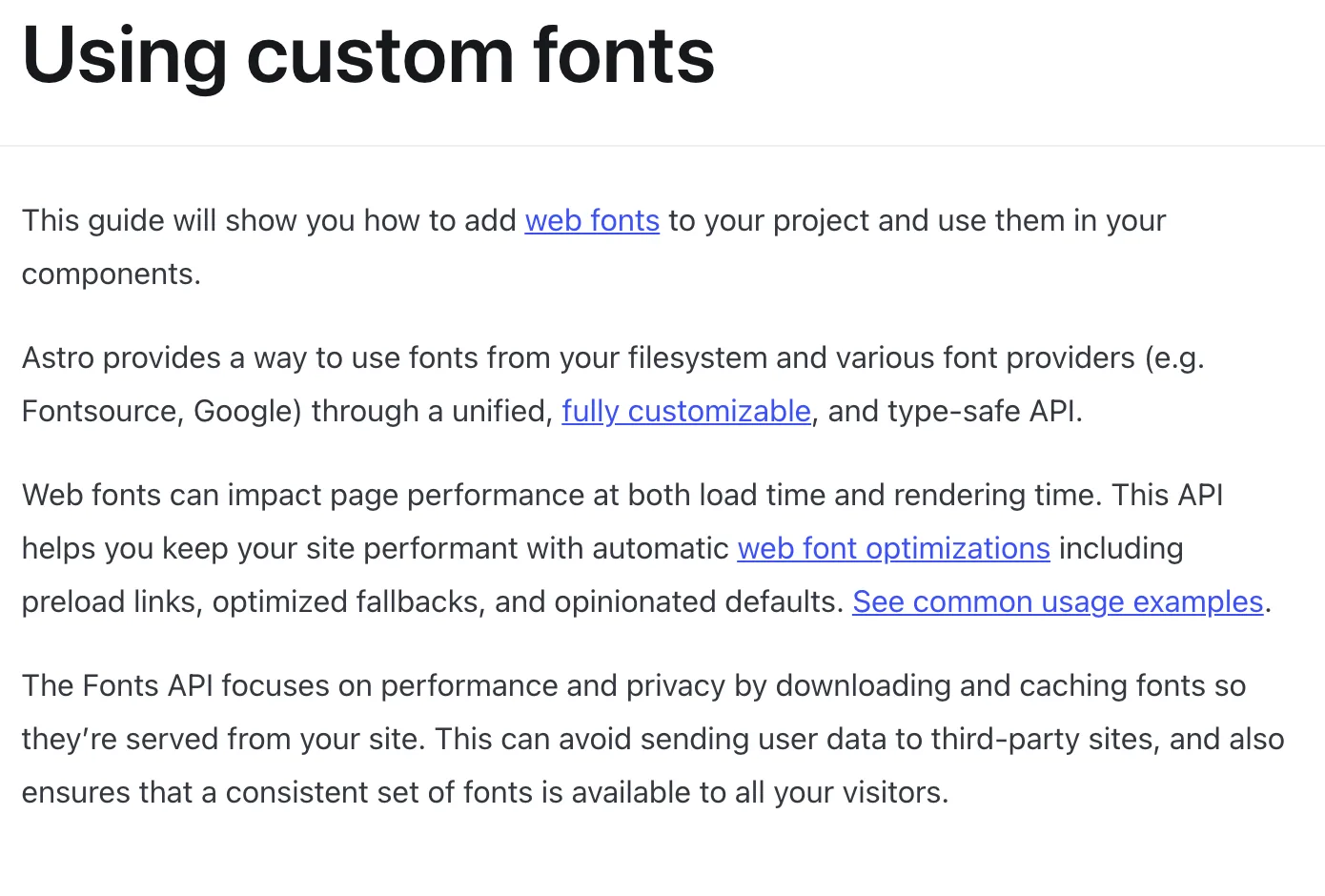
- Astro. The built-in Fonts API downloads the fonts when the site builds, serves them from your own domain, adds preload links and generates fallback metrics so the page doesn’t jump when the real font arrives. That’s how this site does it.
- Anything with npm. Fontsource packages open-source fonts, Google’s among them, as npm packages you install like any other dependency. Astro uses it behind the scenes for ours.
- WordPress or a page builder. Check your theme or builder for a setting that hosts Google Fonts locally before you reach for a plugin.
With Claude Code, one prompt covers it:
Self-host the fonts listed in DESIGN.md so the site makes no requests to
Google at runtime. Load only the weights we use, subset to Latin, preload
only the fonts used above the fold, and add fallback fonts so the layout
doesn't shift when they load.
Then check its work. Open the site, open your browser’s developer tools on the Network tab, reload, and filter by “font”.
Every font file should come from your own domain. If anything mentions fonts.googleapis.com or fonts.gstatic.com, Claude missed a spot.
curl -s https://www.builtwithskills.com/ | grep -c "fonts.googleapis.com\|fonts.gstatic.com"0Where Claude goes wrong with fonts#
Claude’s default choices aren’t bad. They’re just the same as everyone else’s. Give it no brief and it picks whatever is most common, which is exactly the choice that makes your site look like plenty of other AI-built sites.
Anthropic’s frontend-design skill exists partly to fix that. It tells Claude to “choose your typefaces deliberately, not the default families you would reach for on any other project”.
The skill also lists “using all caps for labels” among the commonest tells of a generated page. Anthropic’s prompting docs go further and name “Inter, Roboto, Arial, system fonts” as overused families.
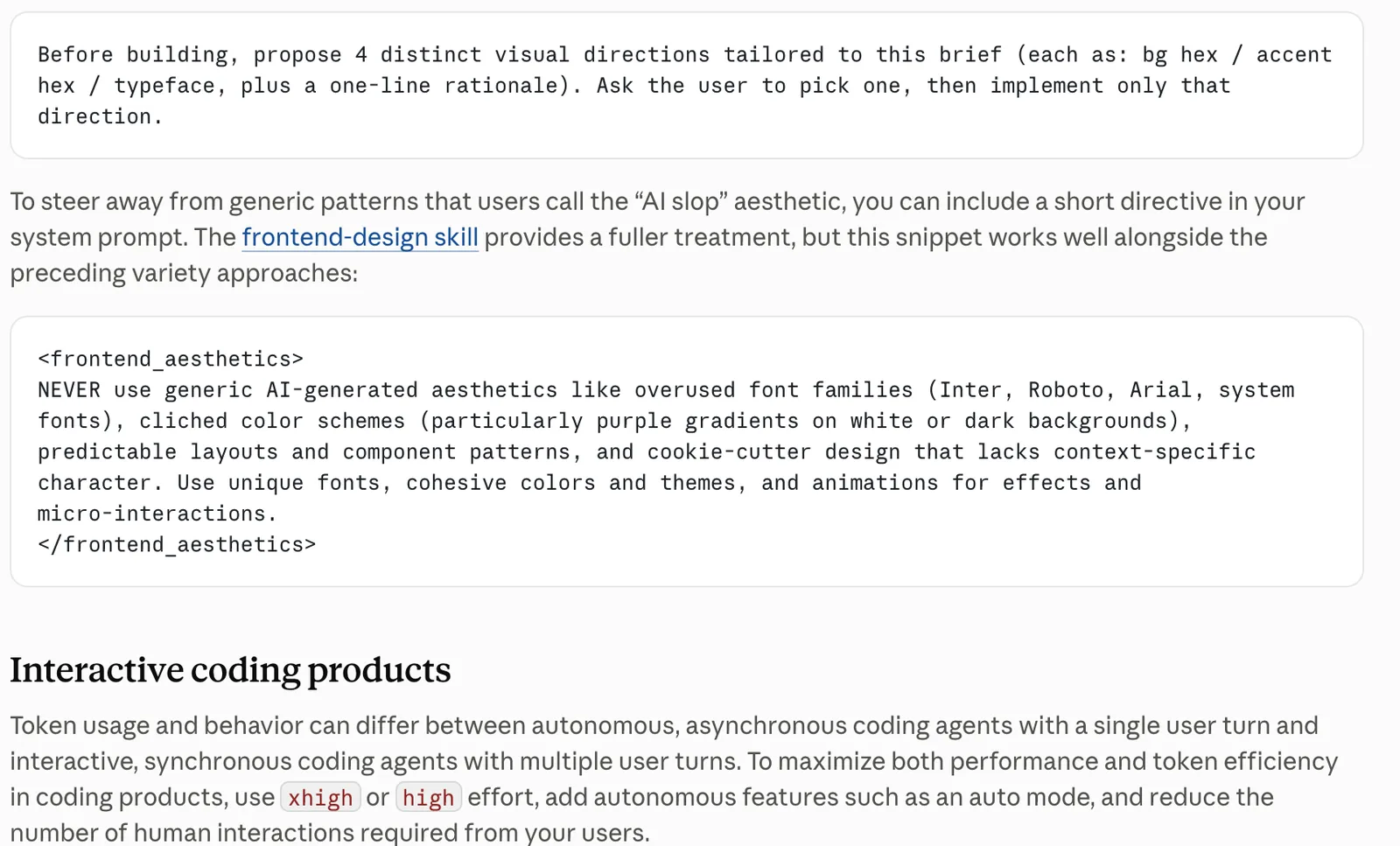
And we break both rules on purpose. Our body text is Inter, because nobody should notice a body font. The small labels above our sections are Poppins in capitals, and both are written down in our DESIGN.md as part of the look.
That’s the real point. A rule you chose and wrote down is design; a default nobody chose is a tell.
Tell Claude once, in DESIGN.md#
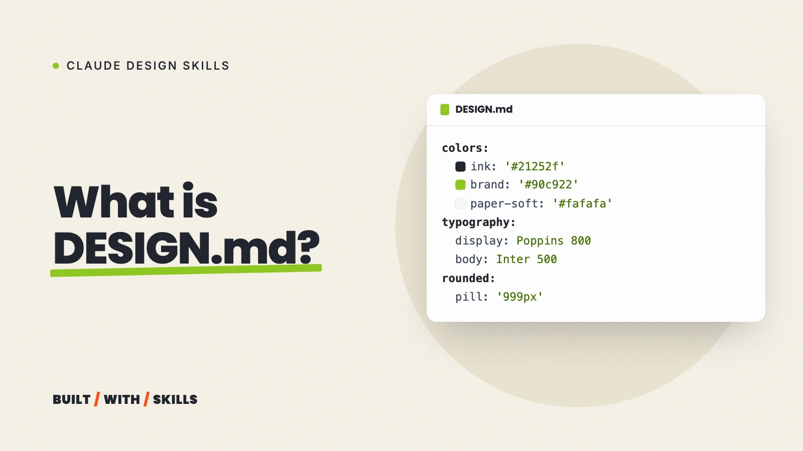
Write your choice into your DESIGN.md: the font for each job, the weights you load, the size for each heading level and a rule like “no other fonts”. Ours keeps it in the token block at the top:
typography:
  headline:
    fontFamily: 'Poppins'
    fontWeight: 800
    textTransform: uppercase
  body:
    fontFamily: 'Inter'
    fontSize: '1.0625rem'
    fontWeight: 500
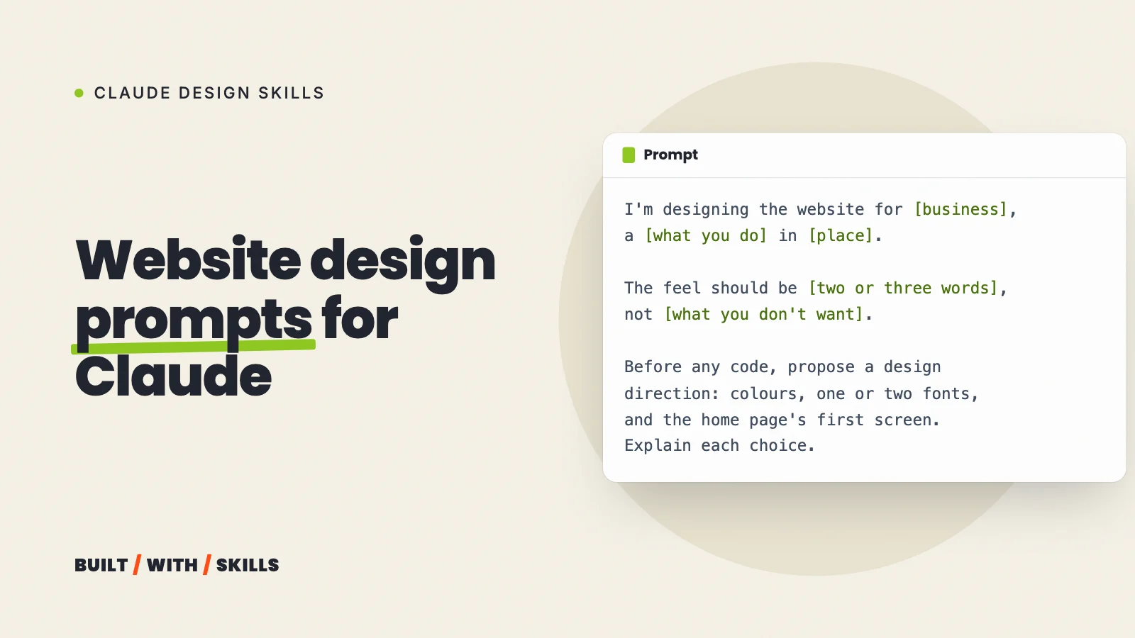
From then on, every page Claude builds uses those fonts, and you never have to say it again. Fonts are only one part of a design brief, though, and website design prompts covers the rest.
grep -n "fontFamily" DESIGN.md18: fontFamily: 'Poppins, Helvetica Neue, Arial, sans-serif'24: fontFamily: 'Poppins'29: fontFamily: 'Poppins'34: fontFamily: 'Poppins'38: fontFamily: 'Inter, Helvetica Neue, Arial, sans-serif'43: fontFamily: 'Inter'47: fontFamily: 'Poppins'