
Ask Claude Code for a new page with nothing written down, and it’ll pick the colours, the fonts and the button shapes all over again. Page twelve drifts away from page one a little at a time, until the site looks like four people built it.
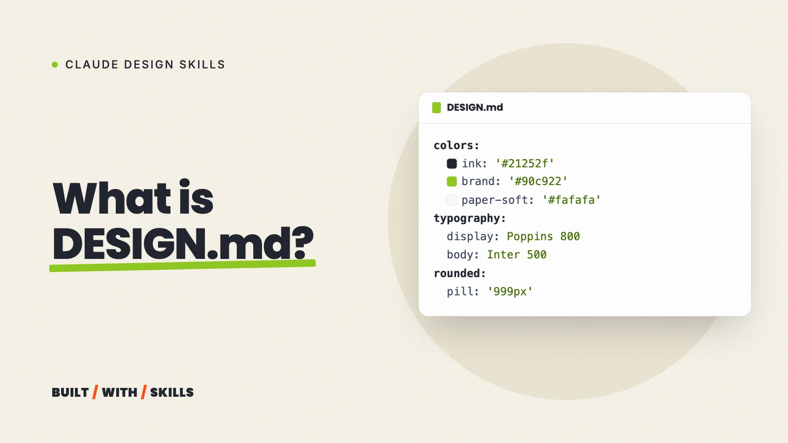
A DESIGN.md puts a stop to that. It’s a plain text file in your project’s top folder that spells out how the site should look (each colour and what it’s for, the fonts and their sizes, spacing, corner radius, how buttons and cards are built) along with the rules that go with it, like “one accent colour” or “no dark backgrounds”. An AI tool that reads it builds to your system instead of guessing a new one.
This site has run on one since 30 August 2026, and we’ve rewritten it twice since. Then, while checking it for this guide, we caught it drifting from the real styles in three places. That turned out to be the most useful lesson in here.
By the end you’ll know:
- What goes in the file, with the top of ours as a worked example.
- How to make Claude Code actually read it, because it doesn’t on its own.
- Three ways to write a first draft, including starting from a brand file in awesome-design-md.
- How to stop it going stale once it’s written.
It’s part of our series on Claude design skills.
What goes in a DESIGN.md#
Google’s Stitch team created the format to carry design rules between projects, and open-sourced a draft specification on GitHub on 21 April 2026. As of October 2026 it’s still marked alpha, so expect it to change.
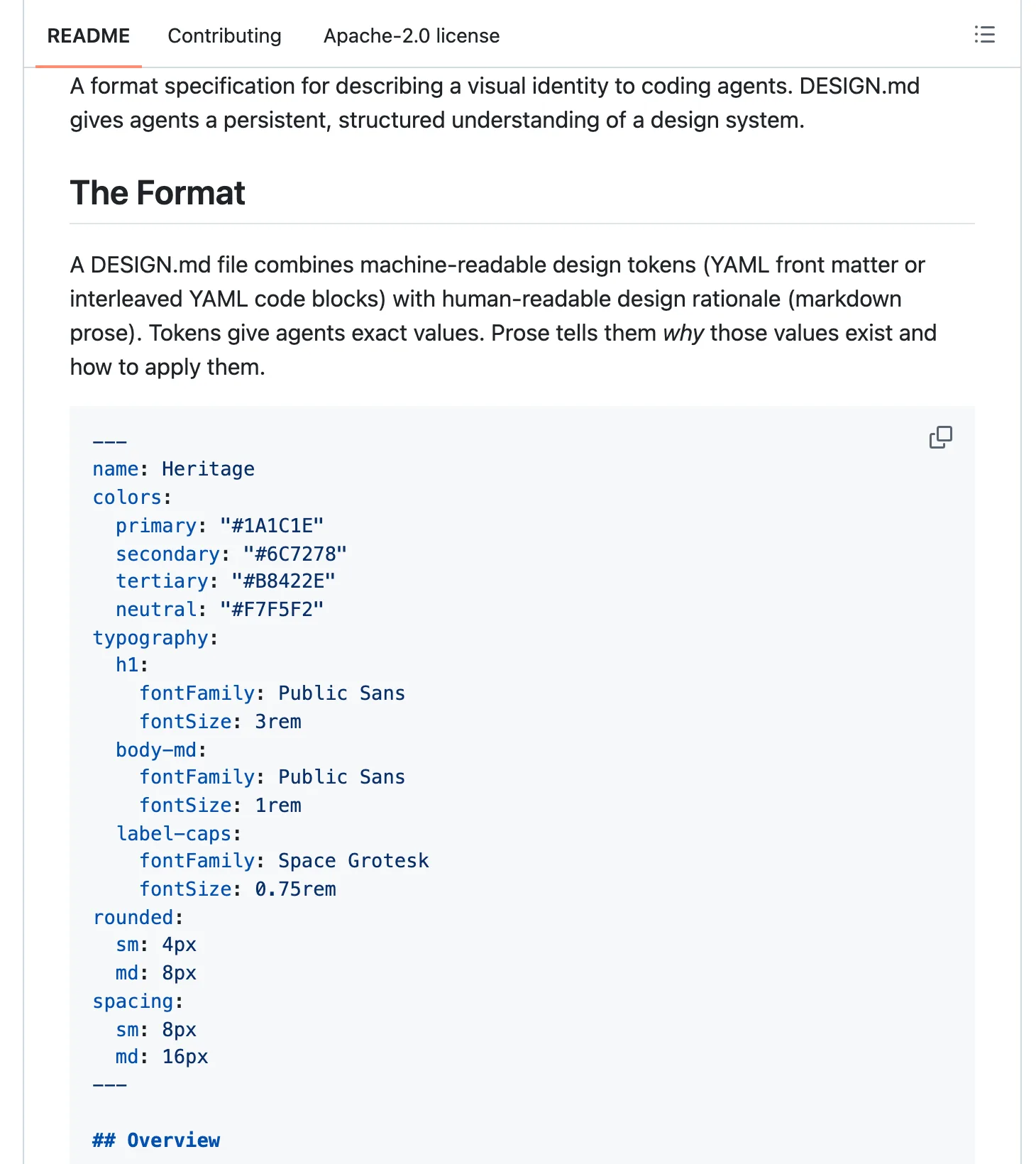
A file has two layers:
- Tokens at the top, in a YAML block between
---lines:colors,typography,rounded,spacingandcomponents. These are the exact values. - Prose underneath, in
##sections that explain how to use those values. The spec lists eight, and any you include go in this order: Overview, Colors, Typography, Layout, Elevation and Depth, Shapes, Components, and Do’s and Don’ts.
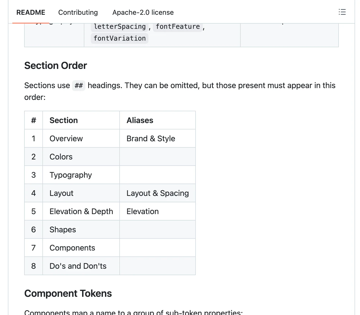
Here’s the top of ours, trimmed down:
---
name: Built With Skills
colors:
  ink: '#21252f'
  ink-soft: '#414e60'
  paper: '#ffffff'
  brand: '#90c922'
typography:
  body:
    fontFamily: 'Inter'
    fontSize: '1.0625rem'
    fontWeight: 500
rounded:
  pill: '999px'
components:
  button-primary:
    backgroundColor: '{colors.brand}'
    textColor: '{colors.ink}'
    rounded: '{rounded.pill}'
---
Those {colors.brand} bits are references. The button picks up whatever the brand colour happens to be, so changing one value moves every component that points at it.
Do you have to follow Google’s format to the letter? No. Claude reads plain English perfectly well.
The spec itself says a tool should keep a section it doesn’t recognise rather than reject the file, which is how ours gets away with extra sections for contrast rules and voice. The tokens are what make the file checkable. The prose is what makes Claude use them properly.
Will Claude Code actually read it?#
Not by itself. Claude Code loads CLAUDE.md at the start of every session, and a file called DESIGN.md sitting right next to it gets no special treatment.
You have three ways round that, and they behave differently:
- Import it. Put
@DESIGN.mdon its own line in your CLAUDE.md. Anthropic’s memory docs say imported files load into context with the CLAUDE.md that imports them, so Claude has your design system in every session, including the ones where you’re only fixing a typo. That’s also the cost, since every line of the file eats context every time. - Tell it in words. A line like “Read DESIGN.md before any design work” is cheaper, but the same docs are blunt about what happens with that kind of instruction for other files: Claude sees the file only if it decides to open it. Most of the time it will. Not every time.
- Let a design skill load it. Impeccable, the design skill we use, loads DESIGN.md (and a PRODUCT.md describing the audience) at the start of its work in each session. That’s how ours gets read, and our CLAUDE.md doesn’t mention DESIGN.md at all.
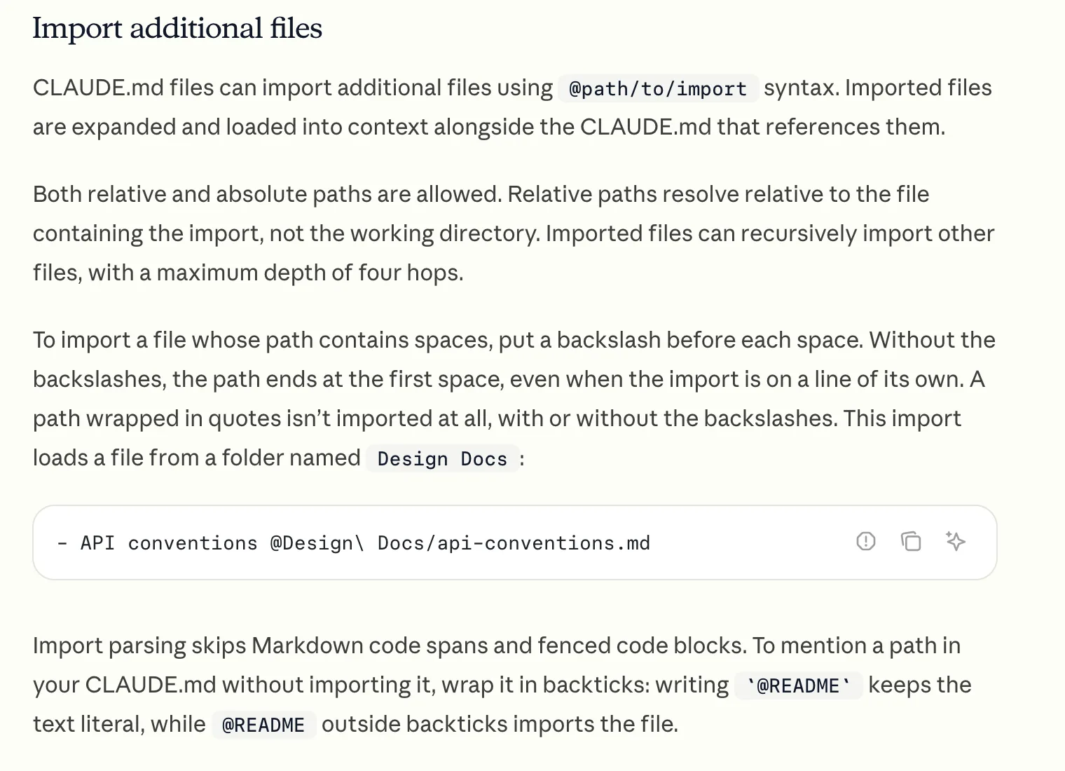
So which one? Our rule of thumb is to import it while the site’s look is still being built, and keep the file short enough that the import doesn’t hurt. Once a skill like Impeccable is doing your design passes, hand the job over and let the skill load it instead.
grep -c "DESIGN.md" CLAUDE.md0Three ways to get your first draft#
Have Claude write it from your existing site#
Already have a site? Then this is the quickest route, because the decisions already exist in your code and Claude only has to write them down:
Read this project's styles and components and write a DESIGN.md in the
format at github.com/google-labs-code/design.md: the colours with names
and what each is used for, the fonts and type sizes, spacing, corner
radius, the components, and a short list of do's and don'ts. Flag
anything that's inconsistent instead of guessing which version is right.
That last line matters more than it looks. A site built over lots of sessions often ends up with several slightly different greys. You want to pick one yourself rather than have Claude write them all into the file as if they were planned.
With Impeccable installed, /impeccable document does the same job and follows the spec’s section order.
Start from a brand file in awesome-design-md#
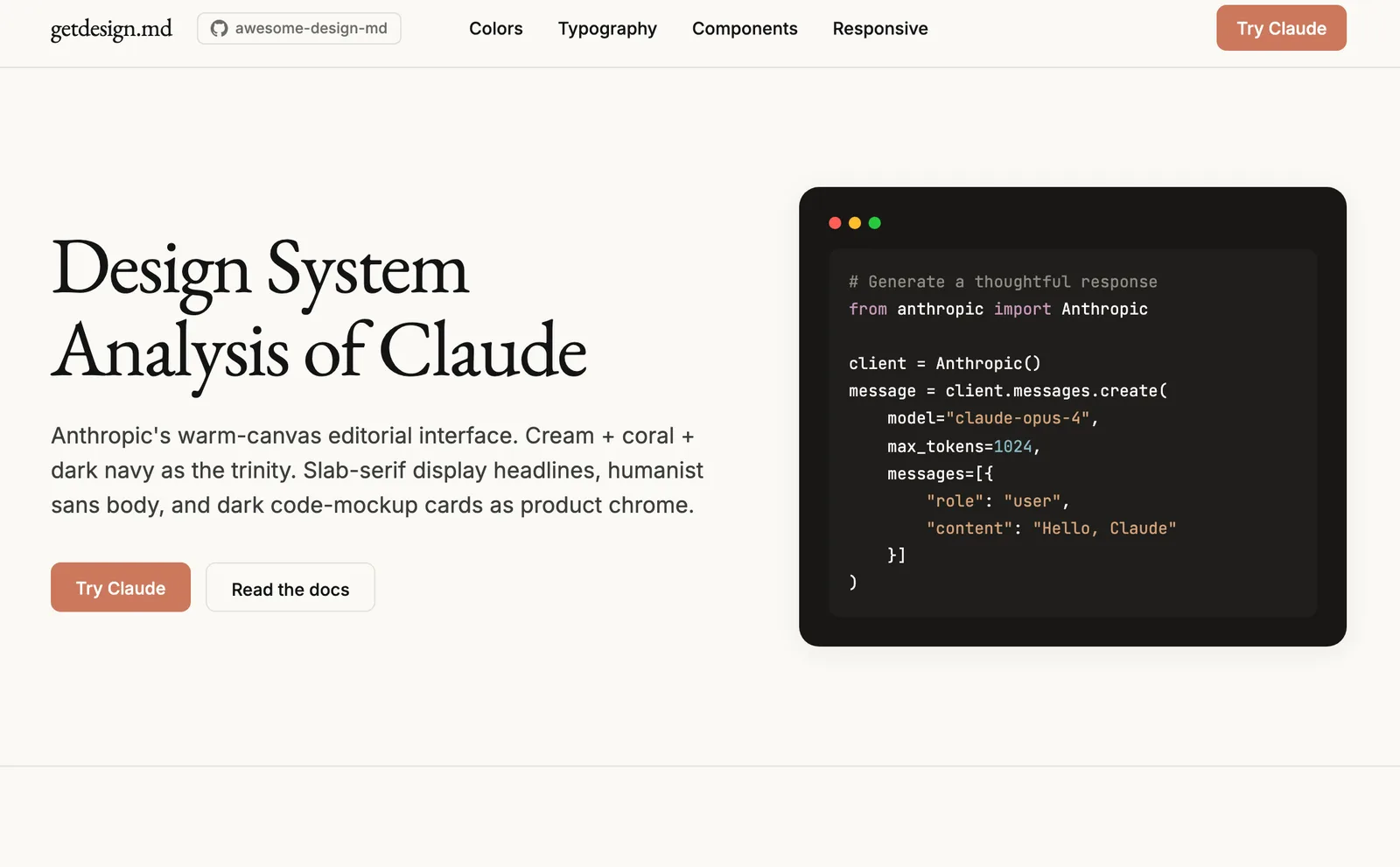
If you want to see what a thorough one looks like, VoltAgent’s awesome-design-md collection is the place. As of October 2026 it holds DESIGN.md files for 84 well-known sites, Airbnb, Apple, BMW and the Claude site among them. It’s MIT licensed, with about 123,000 stars on GitHub, and each brand’s preview page (colour swatches, type and buttons) now lives on getdesign.md.
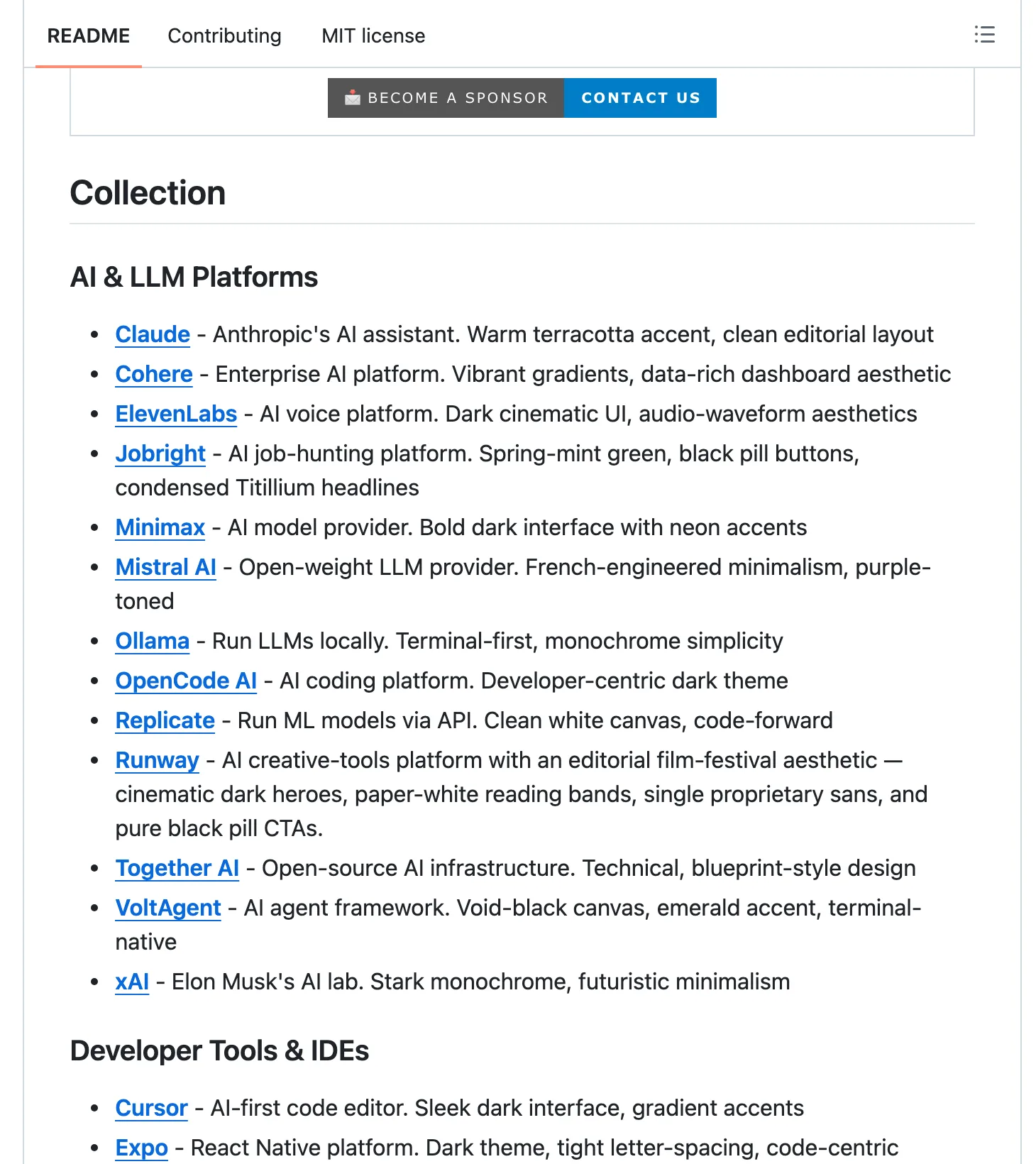
To use one, copy a brand’s DESIGN.md into your project’s top folder and tell Claude to follow it.
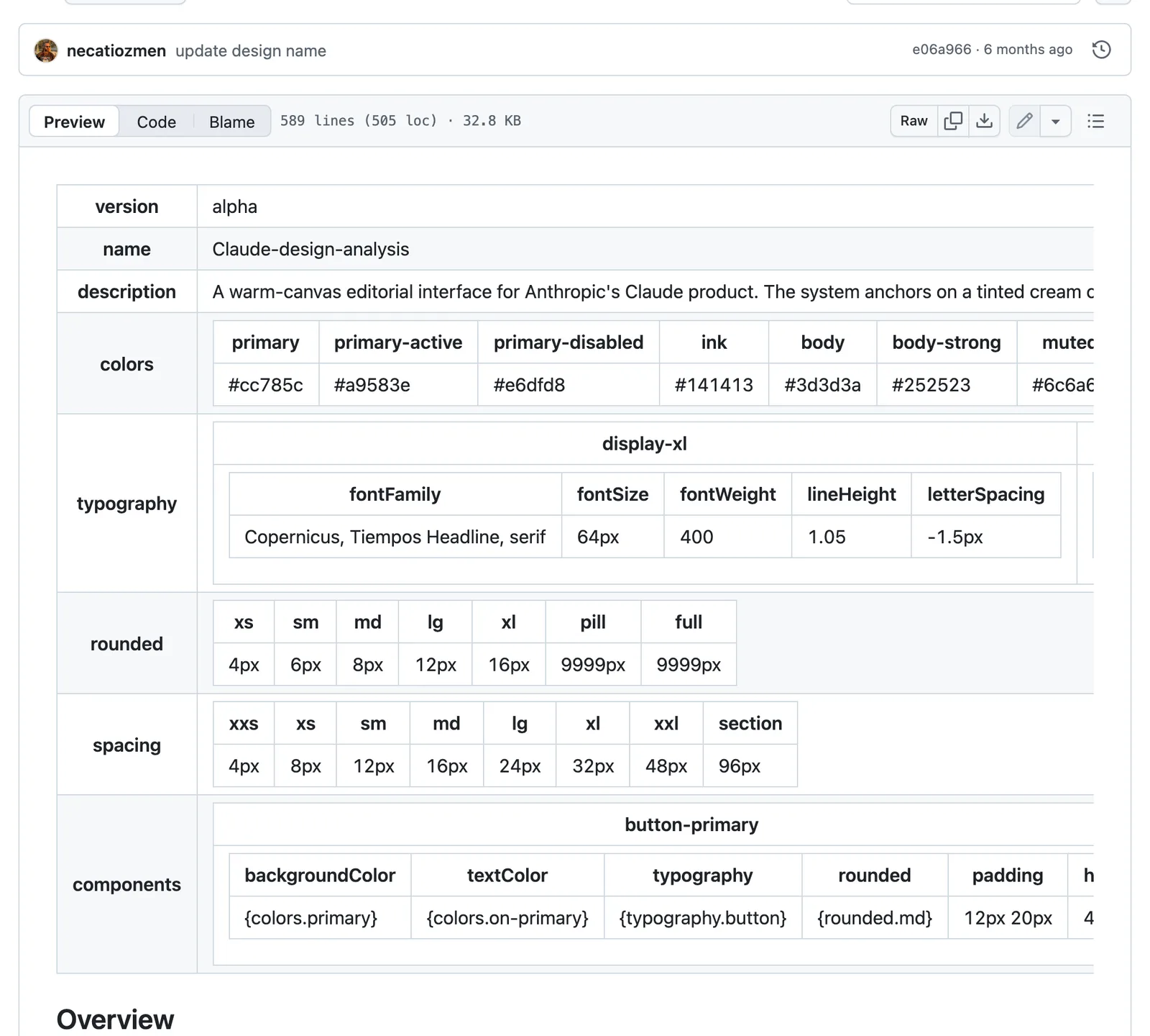
Two warnings, though. These files are reconstructions of public CSS, not the brands’ own documents. They’re also long, and the Claude one runs to 589 lines, more than three times the length of ours.
Use one unchanged and your site will look like that company’s. So treat it as a template, swap in your own colours and fonts, and delete every rule you can’t explain.
Write the decisions first, then the file#
Starting from nothing? Don’t ask Claude to invent a design system and write it down in one go, because it’ll pick the same safe defaults it always picks.
Instead, decide the few things that make a site yours first (one accent colour, a heading font, a body font, how round the corners are, what you never want to see), using the briefs in website design prompts. Only then ask Claude to turn your decisions into a DESIGN.md.
Fonts are the decision that does the most work, and the best fonts for websites covers how to pick a pair.
What makes ours work#
Our DESIGN.md is 176 lines: the token block, then the system in plain English. It’s had three lives.
The first, written on 30 August as the brief for Impeccable, was a guess at another site’s look made from a description, and it got the accent colour, the corners and the heading font wrong. We rebuilt it on 1 September from that site’s real CSS, measured in a headless browser. Then on 17 October we redesigned the whole site on a different model and rewrote the file in the same change.
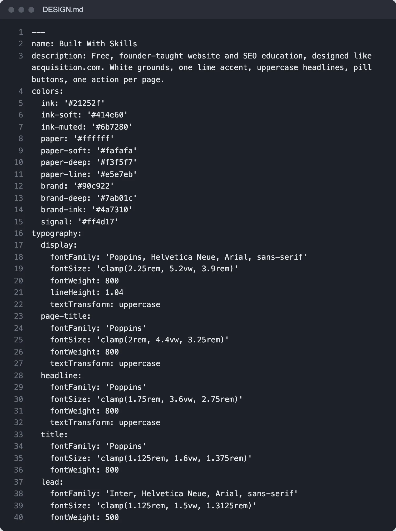
wc -l DESIGN.md 176 DESIGN.mdThese are the parts that earn their place:
- A north star in one line. Ours is “North star: acquisition.com.” Before Claude reads a single hex value, it knows what the page is aiming for.
- Colours with jobs. Every colour has a use as well as a value. Our lime is “Fills: buttons, bar, badges, highlight, stat rules”, and body text uses a softer ink than headings.
- Contrast rules with the ratio. Ink on lime is 7.7:1, so that’s the button. White on lime is about 2:1, which fails accessibility contrast badly, so the file just says “Never.” (The first version of our file had white text on green buttons.)
- Type roles. Which font for headings and which for body, the size for each level, and one line that heads off a subtle problem: weight 800 is the heaviest we load, because the wordmark renders at 800 and loading 900 would change it.
- Layout rules. “5 to 9 sections a page” and “Paragraphs of two sentences at most”.
- Components. A table of the 16 building blocks (hero, buttons, FAQ, cards and so on) with one line each on what it’s for.
- Do’s and don’ts. Do “one lime button per screen”. Don’t use “dark heroes or bands”, “icons as decoration”, “stock or AI photos” or “em dashes anywhere”.
Of all of those, the don’ts pull the most weight. A description of what you want still leaves room for the mistakes Claude makes on its own. Those are predictable enough to list in advance (dark hero sections, decorative icons, a second accent colour creeping in), so write them down before they turn up.
Check it with Google’s linter#
Google ships a command-line checker with the spec. You need Node.js installed, and nothing else:
npx @google/design.md lint DESIGN.md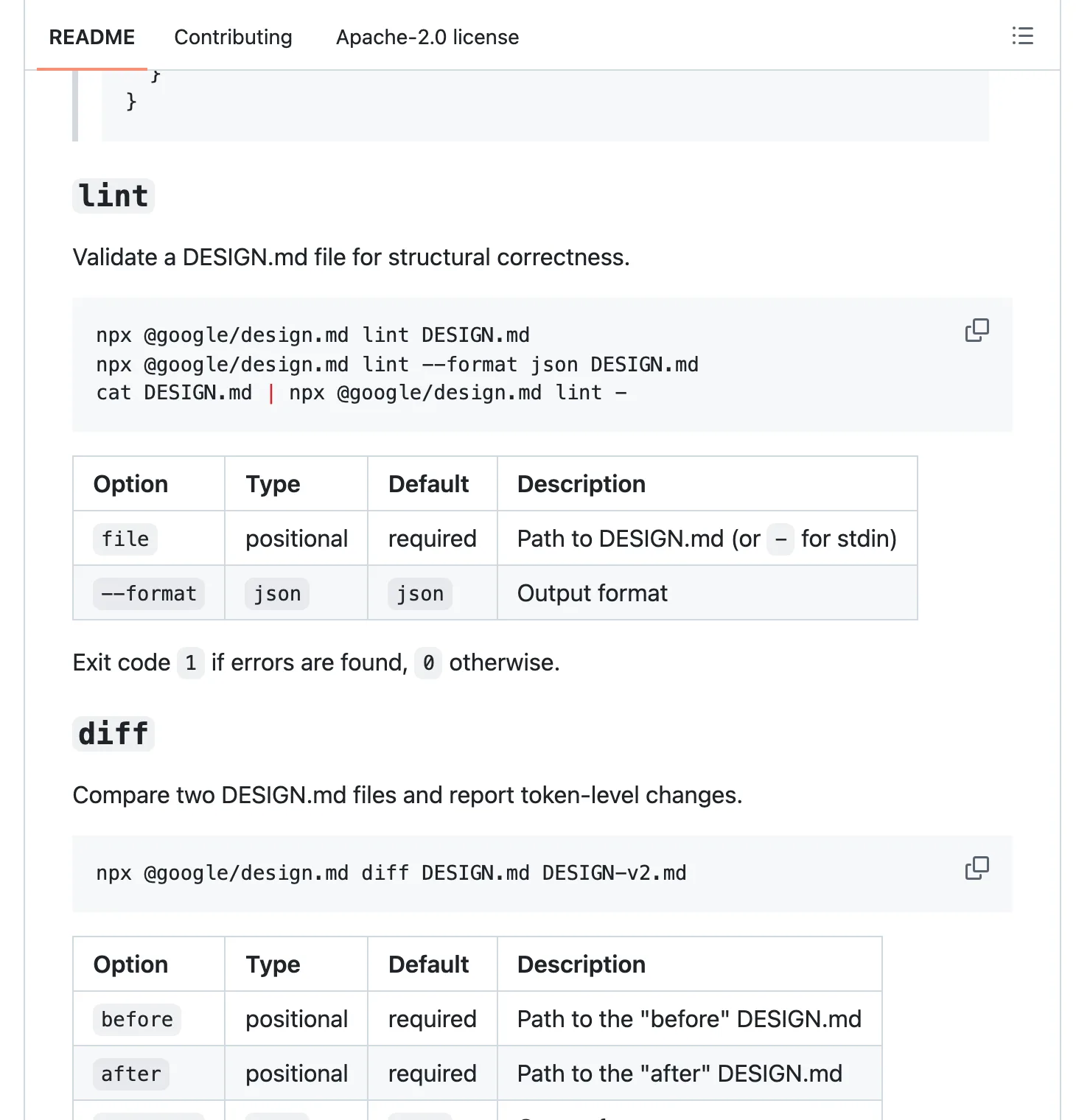
It runs eleven rules and prints what it finds as JSON. The useful ones catch a reference like {colors.brnad} that points at nothing, a button whose text and background fall below the WCAG AA contrast minimum of 4.5:1, and a top-level key that looks like a typo, such as colours: for colors:.
On Windows, PowerShell can trip you up, because the command above can open the file in your Markdown editor instead of checking it, so use npx -p @google/design.md designmd lint DESIGN.md there.
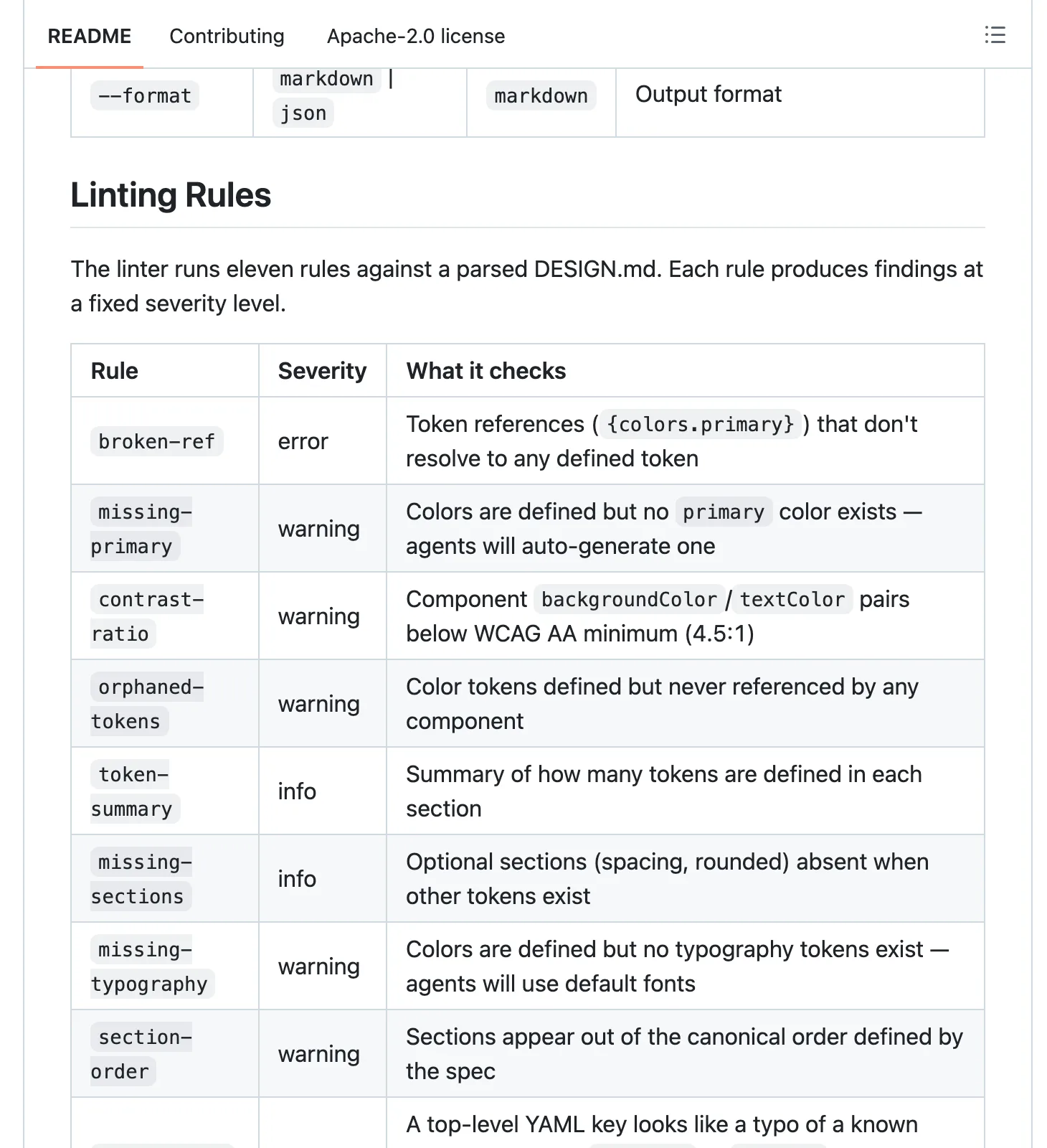
Two more commands are worth knowing. diff compares two versions of the file and tells you which tokens changed, and export --format css-tailwind turns your tokens into a Tailwind v4 @theme block (or dtcg for the W3C token format).
We haven’t run it on our own file yet. Reading the rules against it, we’d expect at least two warnings: there’s no colour called primary (we named ours brand), and our secondary button uses borderColor, which isn’t one of the component properties the spec lists. That’s a reading of the rules, not a result.
npx @google/design.md lint DESIGN.mderror typography.display.fontSize: 'clamp(2.25rem, 5.2vw, 3.9rem)' is not a valid dimension.4 more errors like it, one for each clamp() font sizewarning typography.display.textTransform: 'textTransform' is not a recognized typography property.3 more like it, for page-title, headline and labelwarning components.button-secondary.borderColor: 'borderColor' is not a recognized component sub-token.warning colors: No 'primary' color defined. The agent will auto-generate key colors, reducing your control over the palette.warning colors.ink-soft: 'ink-soft' is defined but never referenced by any component.8 more like it, for ink-muted, paper, paper-soft, paper-deep, paper-line, brand-deep, brand-ink and signalinfo Design system defines 11 colors, 7 typography scales, 3 rounding levels, 3 components.info No 'spacing' section defined. Layout spacing will fall back to agent defaults."summary": { "errors": 5, "warnings": 15, "infos": 2 }Keep it honest#
A DESIGN.md that doesn’t match the site is worse than none, because Claude follows the file.
Our own file drifted within a day. When we rewrote this site on 17 October, the DESIGN.md changed in the same commit as everything else; then a quality pass 90 minutes later changed the styles again, and nobody touched the file.
Checking the two side by side for this guide on 26 October, we found three gaps:
- The hero background is
#fafafain DESIGN.md and#f2f2f2in the stylesheet. - The home page headline is sized
clamp(2.25rem, 5.2vw, 3.9rem)in the file andclamp(2.375rem, 4.6vw, 3.6rem)in the code. - The serif font that guide pages now use for body text isn’t in the file at all.
grep -n "paper-soft" DESIGN.md src/styles/global.cssDESIGN.md:9: paper-soft: '#fafafa'DESIGN.md:97:| `paper-soft` | `#fafafa` | Hero and closing band. |DESIGN.md:132: `paper-soft` hero and closing on the `paper-soft` CTA band.src/styles/global.css:20: --color-paper-soft: #f2f2f2;None of those is a disaster. But each one is a spot where the next page Claude builds from the file comes out slightly different from the pages already live, which is exactly the drift the file exists to prevent.
Change the file in the same step as the style, every time. If that’s too easy to forget, make it a rule in your CLAUDE.md: “when you change a colour, font or spacing value, update DESIGN.md in the same change.” Then once a month, ask Claude to compare the file against the stylesheet and list every difference.
Next in the series: the best fonts for websites, the decision that does more for how a page looks than any other line in your DESIGN.md.