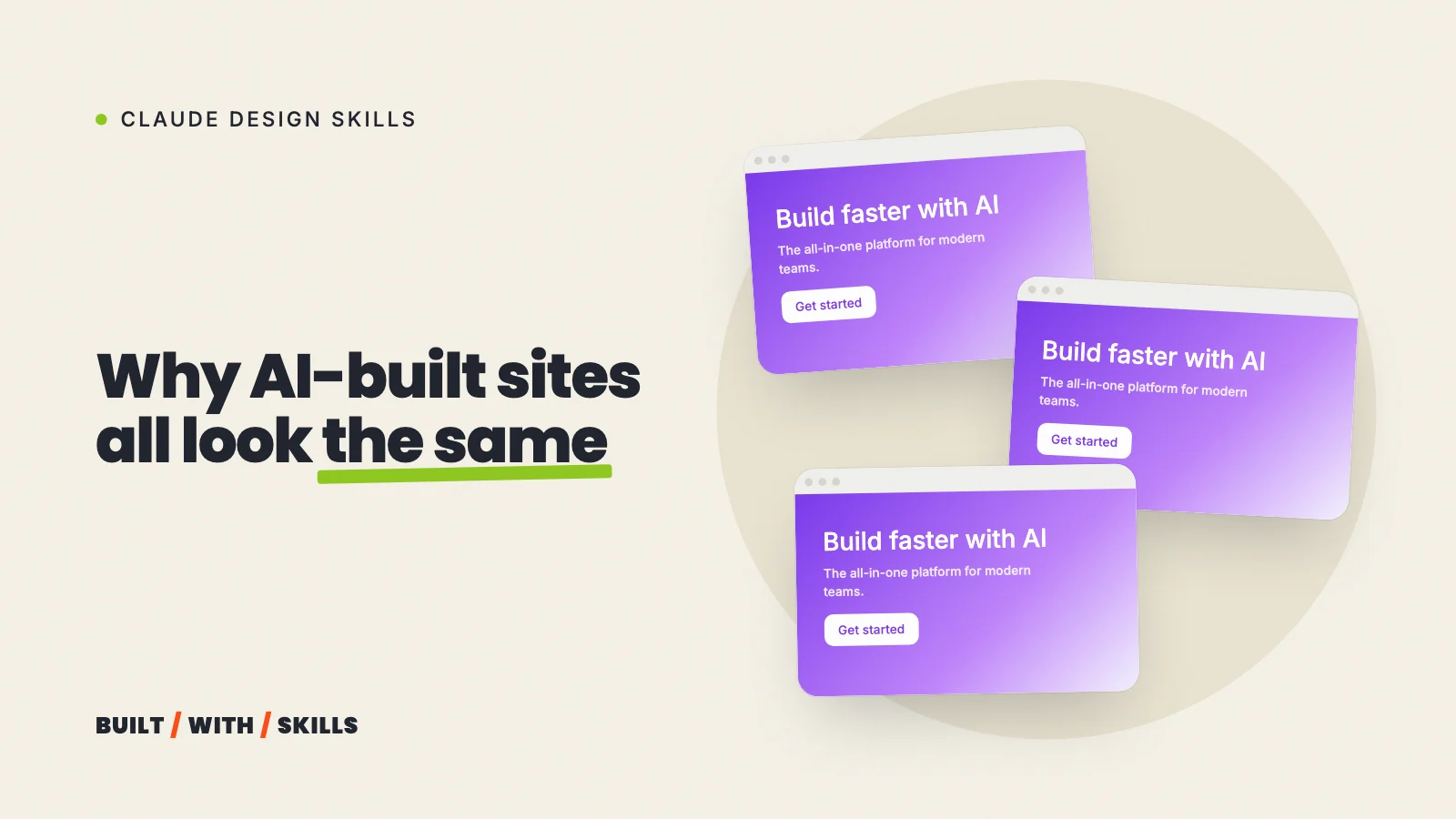

“Design a modern, clean landing page for my business.”
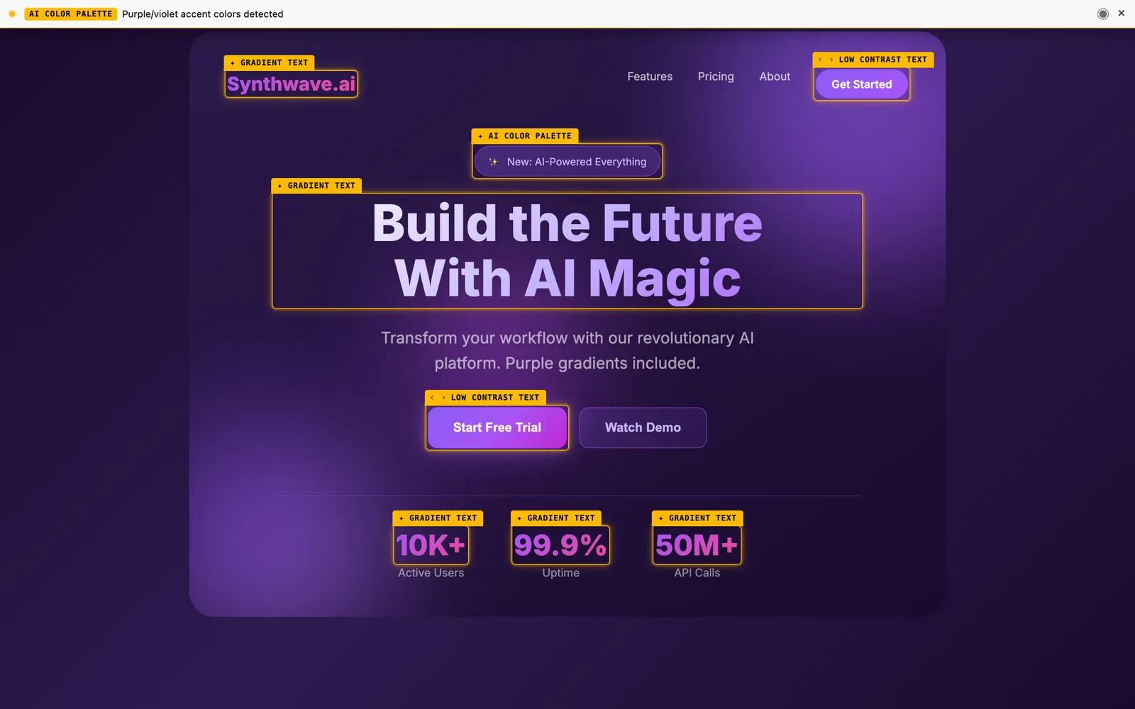
That’s the prompt behind the generic AI look, and it’s easy to see why once you notice that every word in it is a guess Claude has to fill. Modern how, clean compared with what, and for whom? Claude answers each question with the most common answer it knows, so you get a site much like everyone else’s who typed that sentence.
The website design prompts below make those decisions for it. They’re the ones we use on this site with Claude Code, in the order we use them.
Two of them have already caught real mistakes. Measuring a reference site corrected five wrong details in our first restyle, and a critique found that the video on our home page was a live, clickable rickroll.
This guide is part of our series on Claude design skills, and it has a prompt for every step in why vibe-coded websites all look the same.
Why “don’t make it look like AI” doesn’t work#
The obvious fix is to ban things (no purple, no gradients, nothing that looks AI-made). It barely helps.
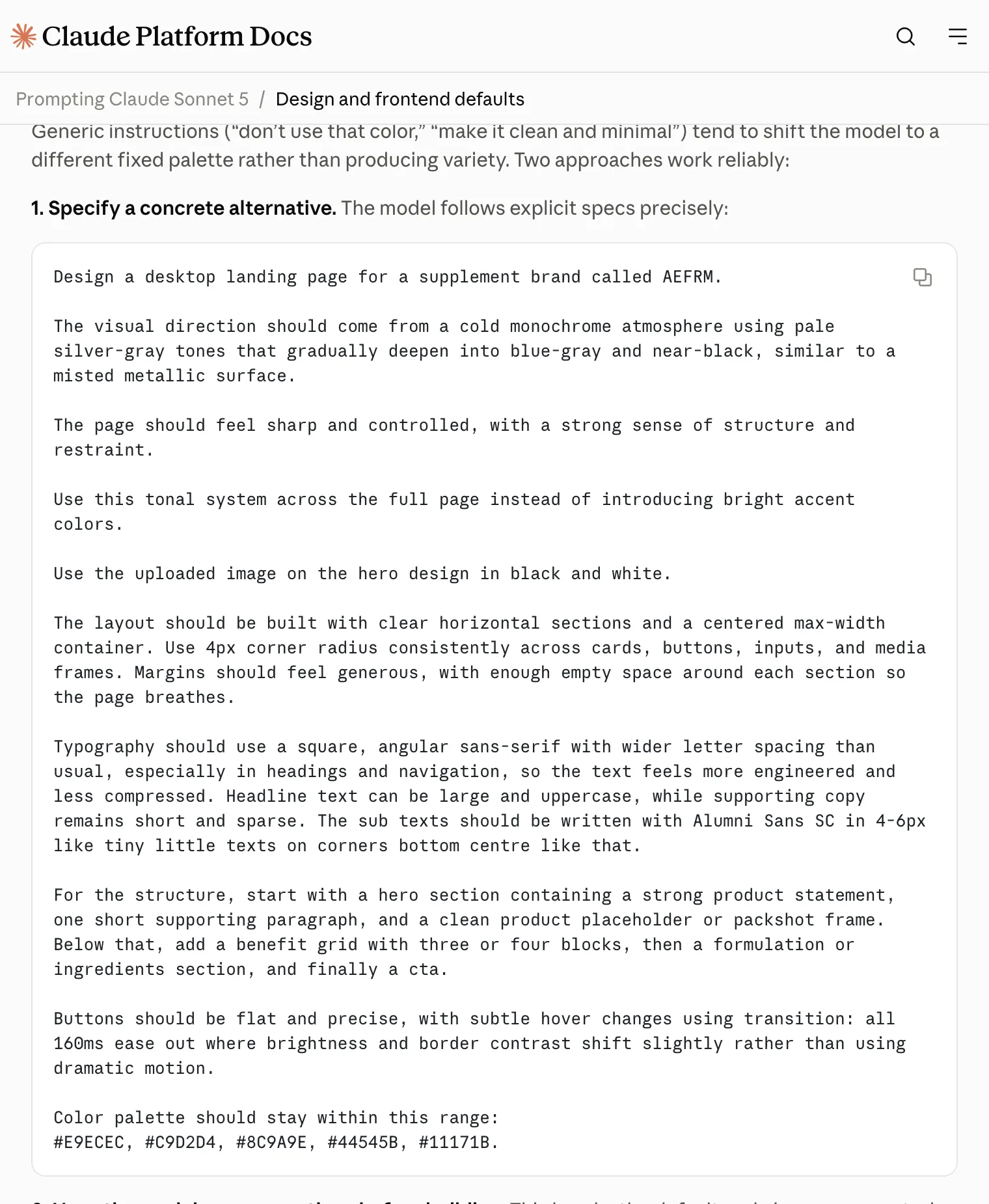
Don’t take our word for it. Anthropic says as much in its own prompting docs for Claude Sonnet 5, which note that generic instructions like “don’t use that color” or “make it clean and minimal” tend to “shift the model to a different fixed palette rather than producing variety”.
Ban one default and Claude moves on to the next. Whack-a-mole.
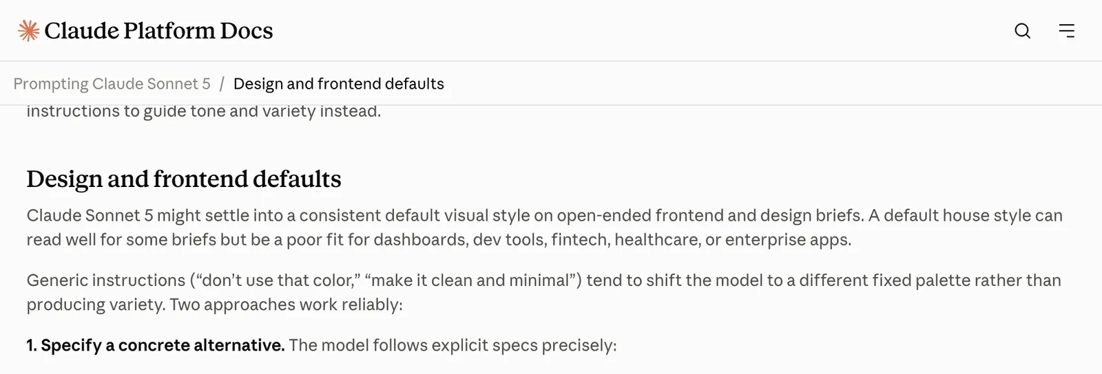
The same page names two approaches that do work reliably. You can give Claude a concrete alternative, because “the model follows explicit specs precisely”, or you can have it propose several options before it builds anything. Most of the prompts below do one or the other.
Before any code#
1. The brief#
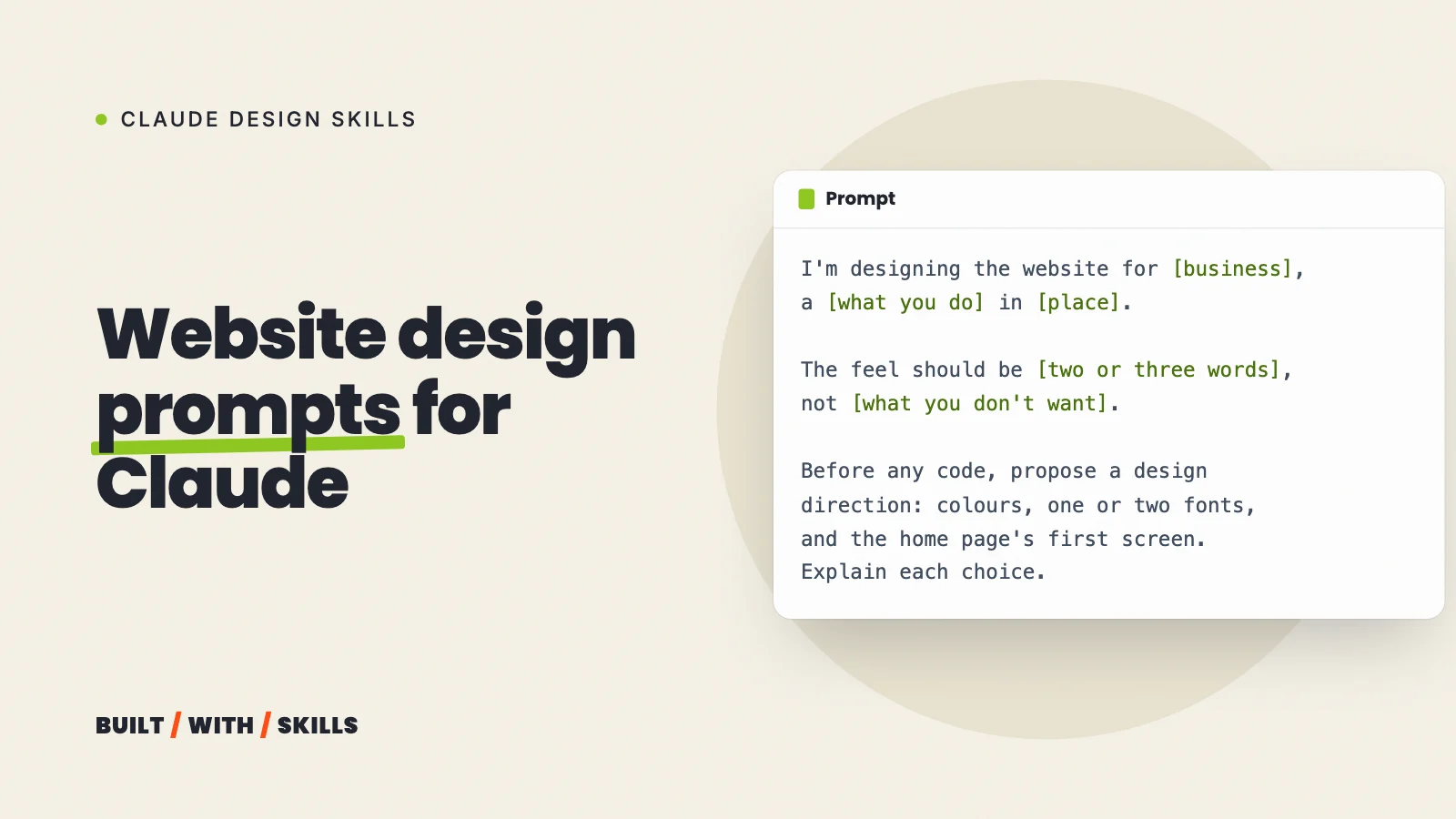
Start every new site, or every redesign, with this one:
I'm designing the website for [business], a [what you do] in [place].
The visitors are [who, in one line]. The one thing I want them to do
is [book / buy / call / sign up].

The feel should be [two or three words, e.g. warm, plain-spoken,
outdoorsy], not [what you don't want, e.g. corporate or techy].

Before any code, propose a design direction: colours with what each is
for, one or two fonts with their jobs, and how the home page's first
screen will look. Explain each choice.
The “not” line isn’t a ban in disguise. “Not corporate” sitting next to “warm, plain-spoken, outdoorsy” tells Claude which way to move, whereas “not purple” on its own only tells it where not to stand.
2. Several directions, then pick one#
Not sure yet what you want? Then don’t let Claude decide for you. This prompt sticks close to the wording in Anthropic’s docs:
Before building, propose four distinct visual directions for this
brief. For each: the background colour, the accent colour and the
typeface, with a one-line reason. Wait for me to pick one, then build
only that direction.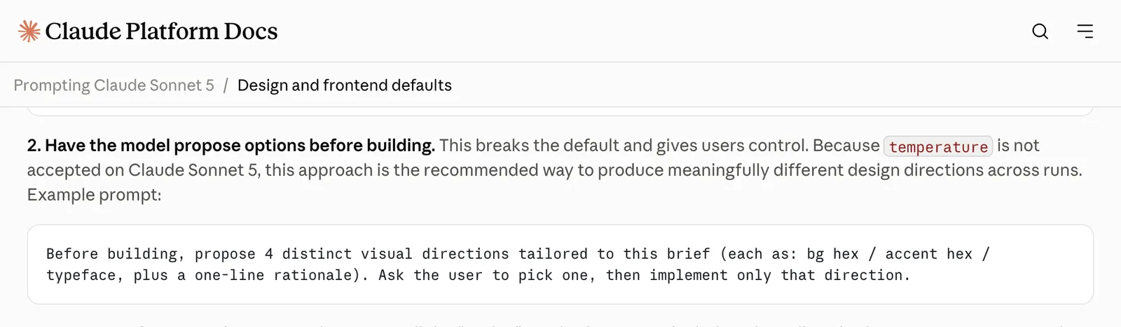
Four short paragraphs are far easier to judge than four built pages, and the one you pick tells Claude more about your taste than any adjective would.
3. A reference, measured rather than described#
Like the look of another site? Don’t describe it. Have Claude read it:
I like the look of [URL]: specifically [the type, the spacing, the
colour, whatever it is]. Open it in a browser, measure the fonts,
sizes, colours, spacing and corner radii it actually uses, and list
them. Don't copy its content or layout; I want the system behind it.
We learned this one the hard way. On 30 August we asked Claude to restyle this site after a web designer’s site we liked, working only from a description, and what came back was close but wrong on almost every detail that mattered:
- An emerald accent, where the real one was lime.
- White text on the accent, where the real site used dark ink.
- Pill-shaped corners, where the real ones were nearly square (3 to 5 pixels).
- Archivo for headings instead of Poppins.
- A shadow on every card, which the real site doesn’t have.
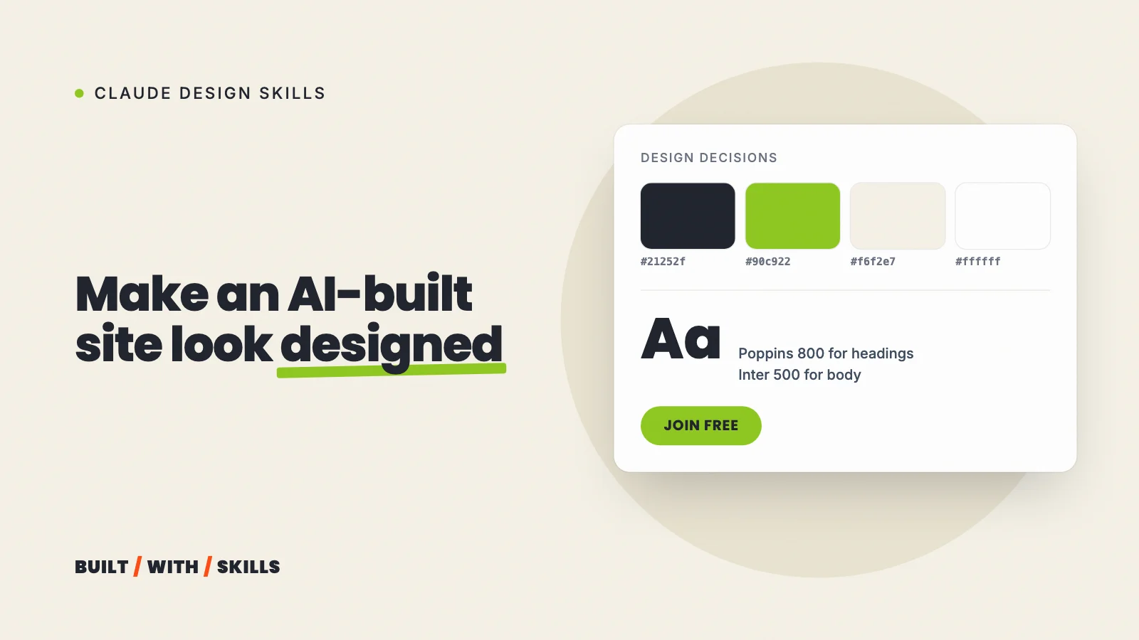
Two days later we had Claude open the real site in a headless browser and read the styles it actually uses. We rebuilt the design system from those numbers, with every value traced back to where it was measured. Measure, don’t describe.
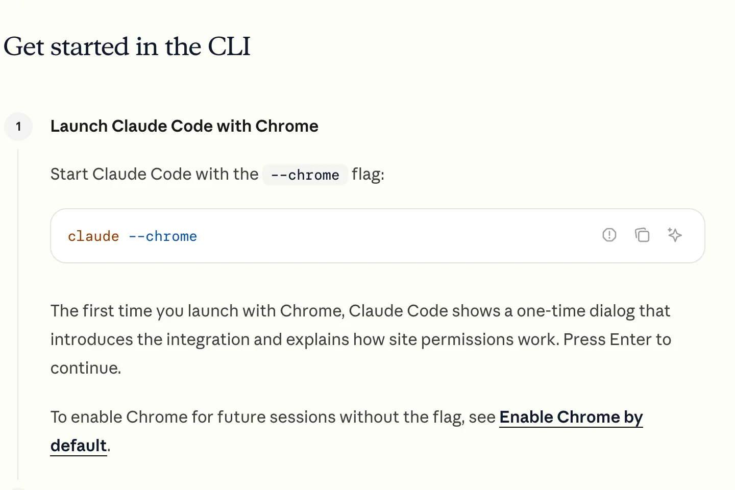
> I like the look of [URL]. Open it in a browser, measure the fonts, sizes, colours, spacing and corner radii it actually uses, and list them.Values recorded in DESIGN.md, each traced to what it was measured fromAccent: lime #90c922, not emeraldText on the accent: dark ink #21252f, not whiteCorners: nearly square, 3 to 5px, not pillsHeadings: Poppins, not Archivo. Body: Inter at weight 500Cards: flat at rest. Shadow on buttons onlyClaude Code needs a browser tool for this. The simplest is Anthropic’s Claude in Chrome extension: install it, start Claude Code with claude --chrome, and run /chrome to check it’s connected (it needs a paid Anthropic plan). This project uses the Playwright MCP server instead, which you add with claude mcp add playwright npx @playwright/mcp@latest.
A screenshot works at a pinch. But Claude then has to estimate the numbers from it, which is exactly the guessing you’re trying to remove.
Write it down once#
Found a direction you like? Make it permanent, or you’ll be repeating your brief in every prompt for the life of the site:
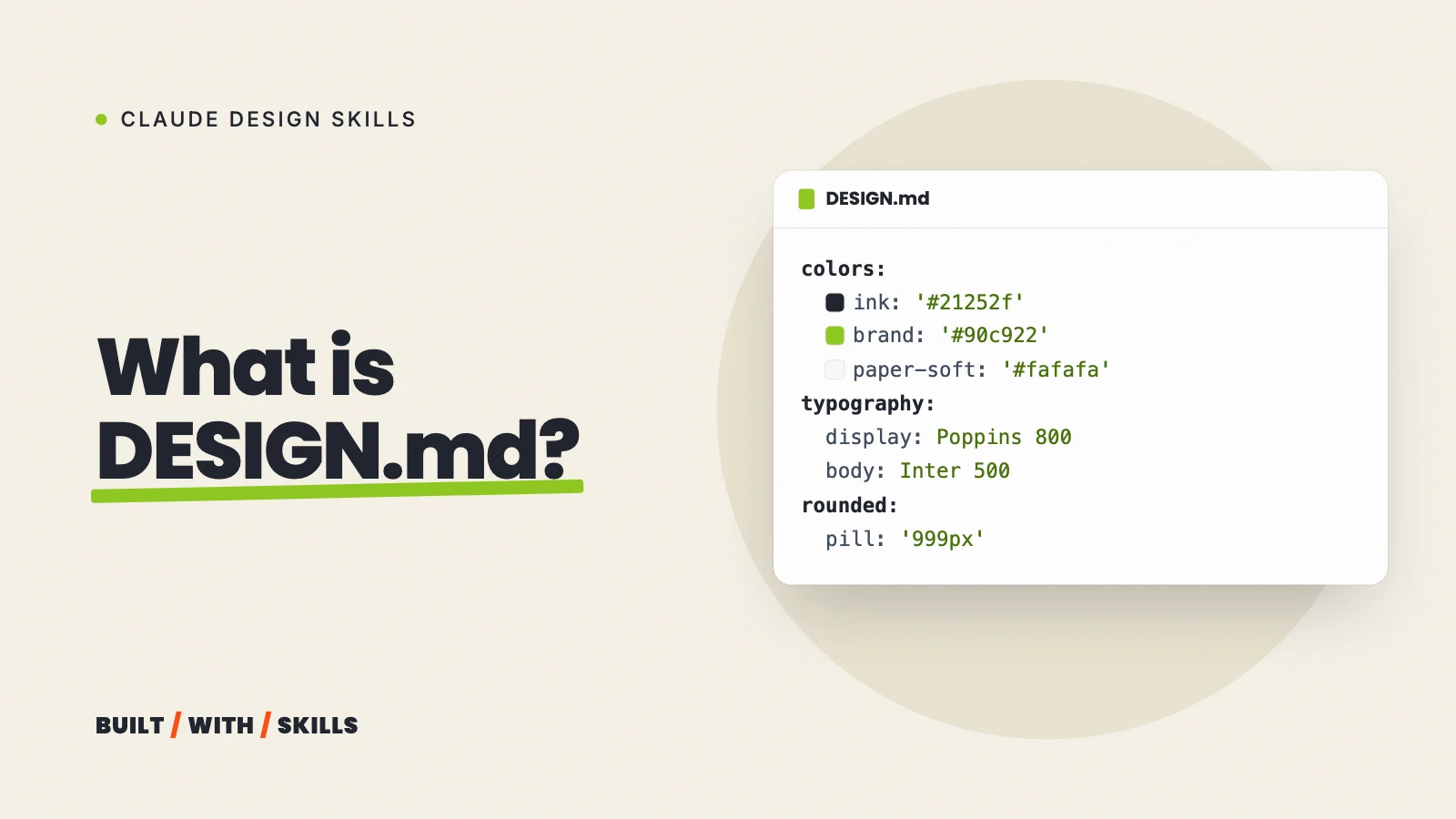
Write a DESIGN.md for this site: the colours with their names and
uses, the fonts and where each is used, the type sizes, spacing, corner
radius, button styles, and a short list of don'ts. Then add @DESIGN.md
on its own line in CLAUDE.md so you load it in every session.
Don’t skip that last line. Claude Code reads CLAUDE.md on its own but not DESIGN.md, and the @ import is what makes it load.
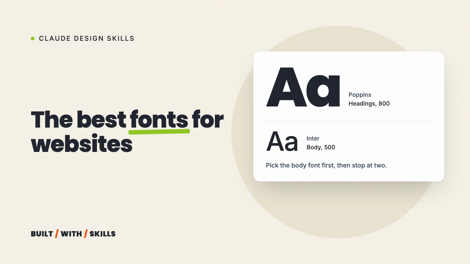
If you want to see a finished one, DESIGN.md: what it is and how to write one shows what ours contains. Stuck on fonts? The best fonts for websites helps with that decision.
The don’ts list is where the real value sits. Ours bans dark hero sections, icons as decoration, stock or AI photos, logo walls, countdown timers and white text on lime, among other things. Every one of them is a default that would otherwise creep back in.
grep -A3 "Don't:" DESIGN.md**Don't:** dark heroes or bands; icons as decoration; stock or AI photos;logo walls; countdowns or fake urgency; speed or income promises; white texton lime; em dashes anywhere.Build one section at a time#
4. The first screen#
Big prompts get average results. So design one section, look at it on your phone, then move on, starting with the screen visitors judge first:
Design only the first screen of the home page, following DESIGN.md.
It should show [a photo of me at work / the question my customers ask /
our product in use], the headline, one line under it, and one button.
Show me before doing anything else.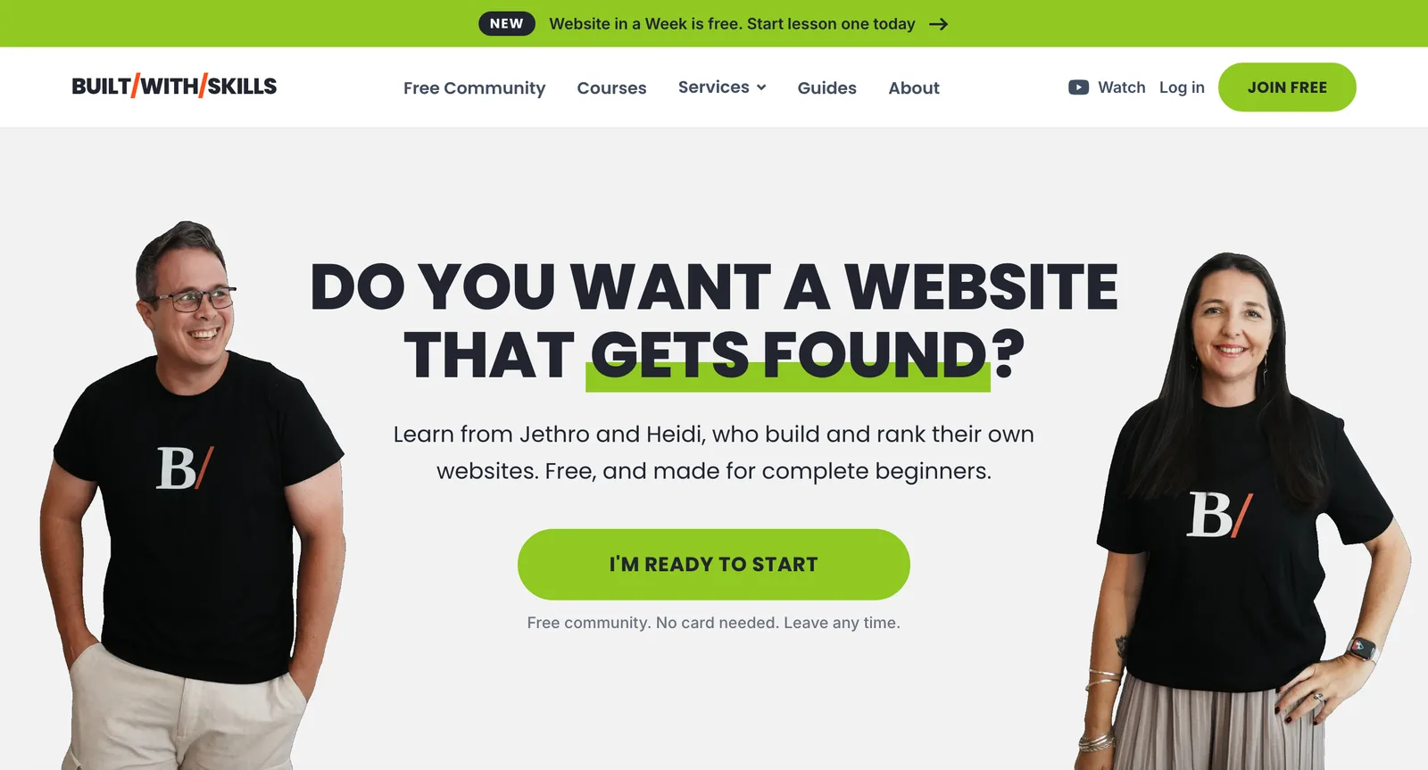
5. Photos: placeholders, never stand-ins#
An empty image slot is the quickest place for a stock photo or a generated person to sneak in, and that face makes a site look like nobody’s. Ask for a placeholder instead:
Where a page needs a photo we don't have yet, show a plain grey box
labelled with the shot it needs (e.g. "Me at the wheel, side-on,
natural light") and the file path to save it at. Never use a stock
photo or an AI-generated person. Keep a list of every photo slot.
That’s our own rule, and it lives in this project’s CLAUDE.md. The grey boxes look unfinished on purpose. Better still, the list doubles as a shot list for the day you finally take the photos.
grep -A3 "Photos are the one exception" CLAUDE.md**Photos are the one exception.** A missing photo renders as a labelled greybox in dev _and_ production (`Photo.astro`), naming the shot and the path tosave it at. Every photo slot is listed in `IMAGES` in `src/config/site.ts`.Never fill one with a stock photo or an AI-generated person.Review before you fix#
6. The critique#
Before you ask for changes, ask for a review that changes nothing:
Critique the home page as a demanding designer would. Don't edit
anything. List what looks generic or AI-made, what's inconsistent with
DESIGN.md, and what hurts readability on a phone, most important first.
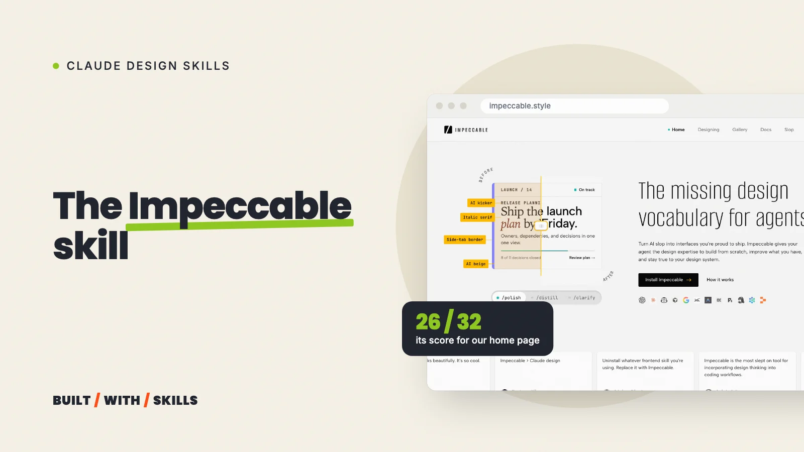
With the Impeccable skill installed, /impeccable critique does this as a structured review. Ours ran on 30 August and scored the home page 26 out of 32, and its top-priority problem was one we’d never have spotted just by looking at the design, because the hero video still pointed at a placeholder ID which made it a live, clickable rickroll.
It also caught that the “Join free” button in the header was hidden at phone widths, and that the page’s 12 sections kept re-arguing overlapping points.
> /impeccable critique the home pageDetector: clean on src/pages/index.astro and src/components/, zero findingsTotal: 26/32 (81%, Good)[P0] Hero video is a live, clickable rickroll, not a placeholderPersona red flagsCasey (mobile): header "Join free" is hidden below sm breakpointHeuristic 8, Aesthetic and Minimalist Design: 3Token system minimal, but 12 stacked sections re-argue overlapping pointsThat’s why the critique comes first. A list you choose from is cheaper than a redesign you have to undo.
7. The fix#
Then pick from the critique, by number:
Fix items 1, 3 and 4 from the critique. Leave everything else as it is.
Check the result at phone width before telling me it's done.
Naming the items stops Claude “improving” the things you liked, and the phone check catches the layout problems that only show up on a small screen.
git log -1 --format=%B 0c1f20cRun formal Impeccable critique on the homepage and polish per findings Add a screen-reader "opens in a new tab" affordance to every externalCircle link, and a reassurance note on the offer ladder's CTA buttons,per a dual-agent design-review + detector critique of the homepage.The critique also surfaced two known content gaps already tracked inCONTENT-TODO.md (the placeholder hero video, unattributed proof shots)which are left for that separate content work.8. The words#
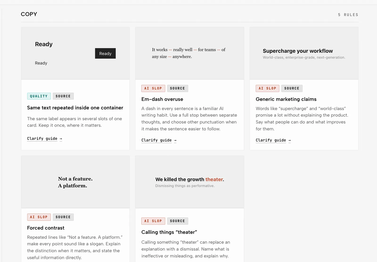
Design is only half the generic look. The other half is copy built from the stock words AI writing reaches for, and no layout on earth fixes that:
Rewrite the text on this page in plain words a customer would use.
Cut any sentence that could appear on a competitor's site unchanged.
Where you need a fact, price or quote you don't have, leave a marked
placeholder instead of inventing one.
The placeholder line is there for the same reason as the photo rule. An invented number on a business site is worse than a gap. For the rest, the Humanizer skill helps.
Words that help, and words that don’t#
Vague words produce average results: modern, clean, sleek, stunning, professional. Every one of them is something Claude has to interpret, and it interprets them the way most sites do.
Concrete words produce decisions instead: “headlines in a heavy sans-serif, all capitals”, “one accent colour, used only for buttons”, “photos of real people at work, no illustrations”, “no gradients, no shadows on cards”. Anthropic’s own example in the docs above goes as far as a 4-pixel corner radius on every card and button and a five-colour palette given as hex values.
Here’s a quick test before you hit enter. If you can’t picture the result from your own prompt, Claude can’t either.